JBbTC 186: Foreign Languages Press pt.2
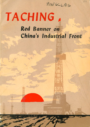
 One of the main things that Foreign Languages Press books have in common is covers that attempt to meld the pastoral (peasants and peasant society) with the industrial (and technological), brought together through a third force, the Chinese Communist Party. The heft given to each of these elements changes with each title, but the formula is basically the same. Taching: Red Banner on China’s Industrial Front focuses on industrial progress, but the fields in the foreground of the cover design remind us of the peasant origins of contemporary China, and the glowing red sun rising on the horizon reminds us who is responsible for this great technological feat—the Communist Party. The author of this pamphlet is anonymous, and if that wasn’t enough of an indication of its clear roll as propaganda, the initial dozen pages of photographs illustrating happy workers making glorious progress seals the deal.
Another interesting element of the design on many of these publications is the use of script-like text, calligraphy which is in English, yet evokes an “Asian” feel. It’s a strange mimicry of Chinese calligraphy which would seem normal on some sort of anti-Chinese propaganda, but is hard to read as part of a pro-Chinese propaganda effort. Outside of the titling type, the interior design of most of the books is clean and simple. The use and design of photography often evokes pristine modernist tropes, with basic layouts that focus the eye towards the imagery.
Much of the cover design features unattributed multi-color block prints, and some even have nice, wrap-around imagery, like The Seeds below. Once again we have the merger of the pastoral and industrial, with tiny red flags on the tractor, factories, and oil refineries.
 The cover to My Hometown is similar to the above. The scene is primarily bucolic, but a giant electrical pylon towers in the mid-ground, showing us how even this rural scene is being improved by the advances of the Party. The use of red is heavily understated, only small daubs for the tractor, bus, and other vehicle on the road. The “Man of Steel” in one of the articles is illustrated with a photograph, showing him happily educating other workers.
 The Golden Bridge is more of the same. Here the “revolutionary” nature of the stories is illuminated by the preponderance of red flags and the blurring of tractors and tanks in the bottom right. The insides here are illustrated with a handful of Mark Trail-like drawings of soldiers and workers. The are always happy, earnest, and painfully stiff. None of the illustrations are attributed to an artist.
 City Cousin continues in the same vein, but on this cover it is collectivity which is featured. Only the mass of peasants holds any weight compared to the scale and scope of the foliage. Once again the interior is sprinkled with expressive line drawings of action scenes. The one below is the most explosive, and appears to reference Manga and other Asian action comics.
I’ve saved the best for last, so next week will focus on my favorite of the Foreign Languages Press publications.
SOURCE: Justseeds: Blog – Read entire story here.


