Bye bye Zaha, hello fried egg! New designs unveiled for Tokyo Olympic stadium | Architecture
It was compared to everything from a bike helmet to a potty, and allowed to spiral to almost double its budget, before being unceremoniously scrapped and declared a national embarrassment. Zaha Hadid’s futuristic design for Tokyo’s 2020 Olympic stadium would have swaggered through the historic Meiji Park like a glossy white stormtrooper, breaching local building codes and leaving the city with a costly white elephant. But are the alternative proposals, finally unveiled this week, any better?
After Hadid’s heady vision, the two new designs might seem a bit bargain-basement. One looks like an undercooked fried egg – a wobbly white roof with a gelatinous, albumeny middle. The other looks like a pile of salad plates cleared away before anyone had finished, with bits of lettuce poking out from between the stack of saucers.
But both are significantly slimmer and cheaper than Hadid’s design – around 153bn yen (£835m), as opposed to 252bn yen (£1.3bn) – and they appear to be models of a lighter-weight, low-key approach that would fit better with the parkland setting. Anonymously released as Design A and Design B, but believed to be the work of celebrated Japanese architects Kengo Kuma and Toyo Ito, both are titled Stadium in a Forest and make prominent use of wooden construction, in contrast to Hadid’s hefty steel arches.
Scheme A (which looks like the work of Kuma to me) has a roof supported by a dense lattice of exposed timber trusses. If well-detailed it could be a magnificent thing, forming a cat’s cradle of interlocking beams above spectators’ heads and recalling the intricate complexity of Japanese joinery. It would be a first for any contemporary stadium, which usually rely on steel and stretchy skins of PVC and ETFE, and a welcome nod to the country’s building traditions.
From outside, its seating terraces look like slender piles of plates, supported on rings of raked columns with the air of a traditional Japanese temple, while the whole thing is garnished with greenery. It’s too early to tell whether it will be token sprigs or full-sized trees (as some views suggest), but it could enable the park to reclaim the structure after the Olympics, engulfing it with greenery.
Scheme B looks more like it was born on Planet Ito. It has the Pritzker prize-winning architect’s trademark amoebic geometries, with an undulating white steel roof that ripples over the seating bowl, like a toned-down version of SANAA’s entry to the original stadium competition. A colonnade of majestic timber columns march around the perimeter, supporting the roof that flares out like a peaked sailor’s cap. The whole thing is proposed to be sheathed in a full-height skin of glass, bringing all the usual metaphors of transparency and reflection, and allowing the structure to “dissolve into the park”.
Whether covering a stadium in plants or glass offers more potential for it to disappear is debatable – and perhaps irrelevant, given that any Olympic stadium will be very visible indeed, no matter what rhetorical flourishes the architects try and achieve. Design B could be ethereal, or it could look like a lumpen IMAX cinema. Design A could be a wondrous wooden tree-house, or a half-baked idea disguised with garden trellis.
Local reaction has been lukewarm so far. “Both designs have a mundane appearance,” Yasuhiro Kimura, a 34-year-old out jogging near the construction site on Monday, told the Japan Times. “I can’t tell one from the other.” “They don’t have the characteristics particular to Tokyo,” added 16-year-old Akihiro Mori, a high school baseball player, in a disapproving tone.
Such reactions hit on the eternal existential nub of any Olympic stadium design: people expect them to be dazzlingly iconic, the pride of the nation capable of seducing the global TV audience at the opening – yet they also insist they must be built at a cut-price cost with as little impact on the context as possible. The two rarely go hand in hand.
Both Kuma and Ito are eminently capable. They understand the Tokyo context – and they both signed the petition to halt Hadid’s plan, lending the latest competition an unfortunate backstabbing air. When Hadid’s scheme was first unveiled, it was met with a blistering assault from the Japanese architectural community. Arata Isozaki, architect of Barcelona’s Olympic stadium, described Hadid’s project as a “monumental mistake” and warned it would be a “disgrace to future generations”. In a lengthy open letter to the Japan Sports Council, the government body in charge of plans for the 2020 games, he railed against the “distorted” process that had led to “a dull, slow form, like a turtle waiting for Japan to sink so that it can swim away”.
Ito was more measured in his criticism, choosing to quietly work up an alternative proposal that would have incorporated the original 1964 Olympic stadium, a 54,000-capacity venue already on the site. He argued it could be upgraded and reused, just as successful refurbishments had been made to the Olympiastadion in Berlin, host of the 1936 Games, and to the Memorial Coliseum in Los Angeles, Olympic host in 1932 and 1984. His alternative could have been the best option of all – if the structure hadn’t already been reduced to a pile of rubble.
As for Hadid, her practice is bitterly disappointed at the way they have been treated. They had always maintained that the spiralling costs were a result of rising construction costs in Tokyo, not their design.
“It is disappointing that the government did not even consider working with the existing design team to build on the two years of design work they and the Japanese people had invested,” said a spokesman for the practice. “The rules of entry to the new competition restricted the existing design team, as well as many other Japanese and international architects and contractors that wished to take part, from entering. There are now serious risks of a rushed process, with no certainty on the likely construction costs of the stadium, and that it may not be ready in time or deliver a significant sporting legacy without expensive conversion after the 2020 Games.”
The risks are real, and the whole process has been a sorry but familiar saga. Originally intended to host the 2019 Rugby World Cup, the new stadium now won’t be ready in time. But, whichever option they choose, I’m looking forward to seeing what could be the first wooden Olympic stadium in history. As long as they go easy on the fireworks.
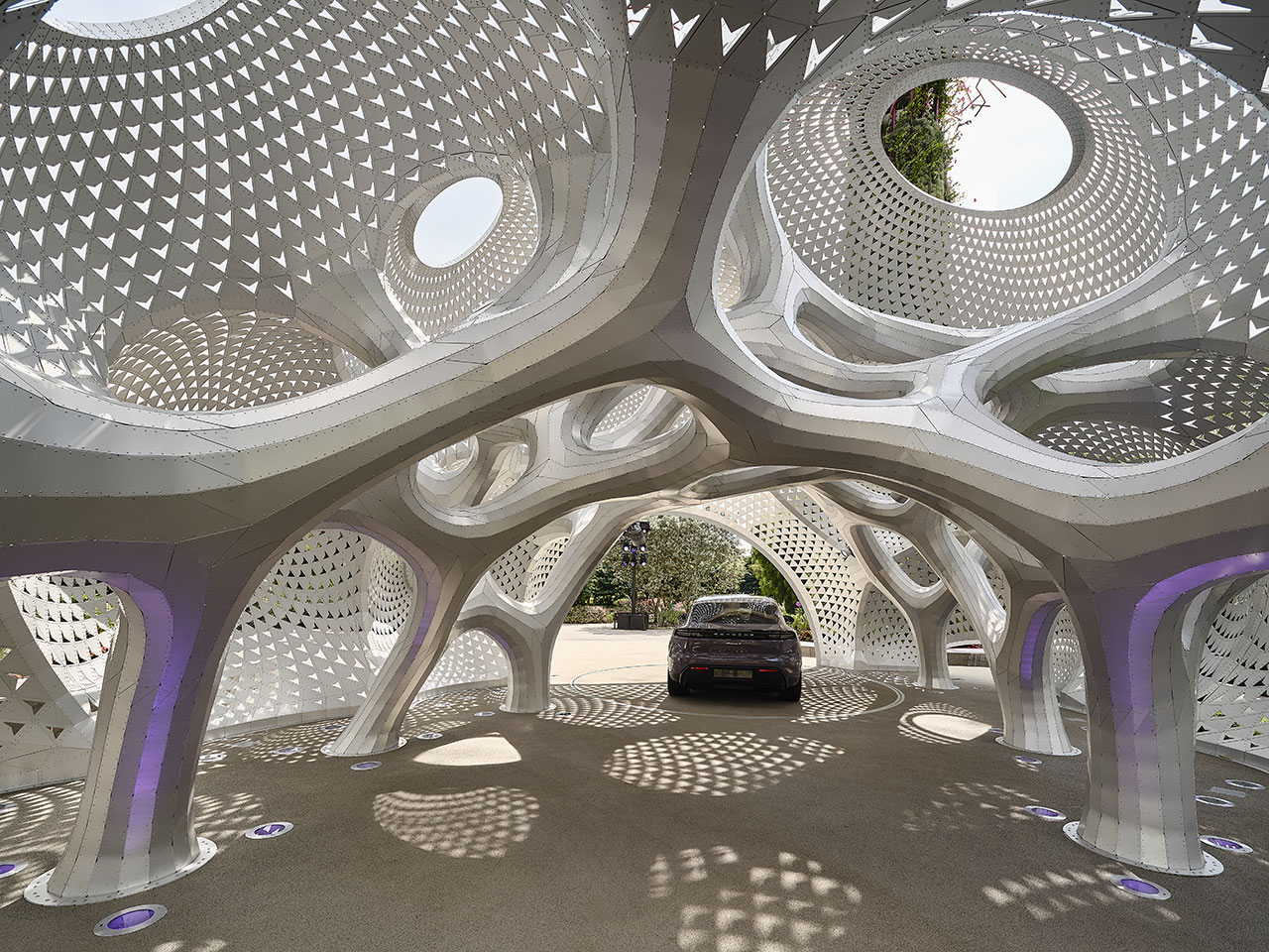
A Geometric Pavilion for Porsche Made of 6,380 Aluminum Strips
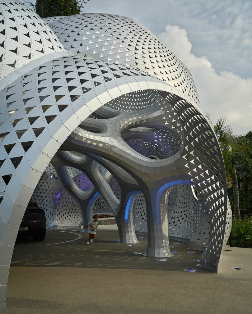
In an innovative fusion of art, design, and engineering, architect Marc Fornes / THEVERYMANY and Porsche created My Two Cars Garage, a geometric pavilion crafted to celebrate the debut of the all-electric Porsche Macan. Showcased during Singapore Art Week, this structure brings together cutting-edge design principles and the shared ethos of both collaborators – performance, precision, and aesthetic excellence.
The partnership between Porsche’s Michael Mauer and Marc Fornes, founder of THEVERYMANY, represents a blend of distinct yet complementary design philosophies. Mauer’s focus on clarity, functionality, and dynamic tension aligns seamlessly with Fornes’ signature techniques of Essentialism (“what you see is all there is, yet it’s so much more”), Specificity (“each part has a unique position and purpose”), and Frozen Tension (“where strength is derived from geometry, not material”). Together, their work transcends conventional design, creating a pavilion that serves not only as a structural marvel but also as an experiential art form.
At the heart of the design is its monocoque shell, an ultra-thin, self-supporting structure that eliminates the need for internal supports. Composed of 6,380 uniquely shaped aluminum strips and 202,203 rivets, the pavilion achieves both strength and fluidity through advanced computational design. Each piece interlocks perfectly to form a continuous double-curved surface, demonstrating how material efficiency and structural performance can coexist in a visually striking form.
One of the pavilion’s most dynamic features is its play with light. Inspired by the Porsche Macan’s intricate body detailing, thousands of perforations punctuate the aluminum skin. By day, sunlight filters through, creating ever-changing patterns of light and shadow. At night, the pavilion glows from within, evoking a sense of motion and adding a layer of spectacle to its architectural presence. This interplay invites visitors to engage with the space in different ways, depending on the time of day.
Prefabrication and modular assembly played a crucial role in the pavilion’s construction. Each component was crafted off-site, then pieced together on location with precision akin to assembling a high-performance vehicle. This method not only streamlined the construction process but also ensured a flawless, joint-free surface that mirrors the sleek design of Porsche’s vehicles.
Far more than a conventional display stand, “My Two Cars Garage” is an immersive environment designed to showcase the Macan’s innovative features. The pavilion’s flowing curves and tubular profiles frame the car as a central exhibit, while the open layout allows for dynamic interactions. Whether hosting one or two vehicles, the space becomes an integral part of the reveal experience, blurring the lines between architecture and performance art.
Positioned within Singapore’s Gardens by the Bay, this 13-meter-long by 7-meter-tall pavilion offers a glimpse into the future of automotive exhibitions. By integrating Porsche’s commitment to innovation with Marc Fornes’ expertise in computational design, “My Two Cars Garage” redefines how vehicles are experienced and celebrated.
For more information on the “My Two Cars Garage” or Marc Fornes / THEVERYMANY, visit theverymany.com. For more on Porsche, visit porsche.com.
Photography by THEVERYMANY and DoubleSpace.

Benedetti unwraps detailed plans for RIBA House of Architecture – Architect's Journal
Benedetti unwraps detailed plans for RIBA House of Architecture Architect’s Journal
Source link
‘This is a load of cobblers!’ Boris Johnson grilled over garden bridge | Architecture
“This whole thing is a load of cobblers!” huffed a flustered Boris Johnson, sitting at his round table in London’s City Hall on Thursday afternoon. “We need to get on and build this bridge … you just cannot bear the idea that a great project is going ahead. That is what this is all about. A load of cobblers.”
It was the surreal climax to what felt like something of a festive garden bridge pantomime. The fairy lights of a Christmas market twinkled through the windows while tourists shuffled along the south bank clutching cups of mulled wine, oblivious to the heated debate going on inside the chamber. The mayor had been summoned, along with the head of Transport for London Mike Brown and its planning director Richard de Cani, to explain themselves to the Greater London Authority’s Oversight Committee over the murky genesis of the proposed garden bridge. And Boris, chief bridge booster, was getting increasingly hot under the collar.
“The whole tenor of this conversation is completely out of whack!” he barked. “You’re trying to cast a cloud … you’re just a bunch of—”
The cross-party committee was here to get to the bottom of why the garden bridge project has followed such an unconventional, fast-tracked process since Joanna Lumley first wrote to Johnson in 2012 with an idea for a fairytale crossing. Following a calm, level-headed line of questioning, they asked how the mayor first heard of the bridge idea; if he knew Lumley was an Associate at Heatherwick Studio [the bridge’s architect] when they met; how many meetings they’d had before the official tender was launched; why TfL’s own legal advice about how to procure the project was ignored; and why the strong criticisms of the process in the internal audit were removed.
It was a forensic grilling, aided by a weighty stack of confidential documents released after countless Freedom of Information requests, that was batted back by a combination of Boris bluster and procedural admin-speak from Brown and de Cani.
The chief contention hangs over how Heatherwick was selected for the project, and the suggestion that his scheme was a done deal from the start – which was a concern of TfL’s own legal team. “We are aware that Thomas Heatherwick has already raised with the GLA and TfL the possibility of a garden bridge,” TfL’s lawyers wrote in January 2013, in a letter giving advice for procuring “specialist design services” for the project. “Care will be needed to ensure that, particularly in relation to timing of the competition and its specification, other bidders have an equal opportunity to pull together all the relevant disciplines and to put their ideas forward.” The letter goes on to add that “it will be important to ensure that is not, and does not appear to be, the case that decisions have already been made about the proposed structures.”
The advice is crystal clear: “The procurement of the design team for the bridge will need to be subject to competition through OJEU [the EU public sector procurement mechanism].”
But that didn’t happen. Instead, TfL decided to split the process in two. In February 2013, it ran a small tender process to procure a design advisor to “help develop the concept” (which was capped at £60,000 to avoid going through the full OJEU process). Heatherwick was selected, receiving a higher score for bridge design experience than two other experienced bridge architects. His submission, which was also released as part of a FOI request, is not a feasibility study at all, but merely an elaboration of his own garden bridge design, with Lumley listed as an Associate of the studio.
Then in April 2013 a second tender was issued “to develop the technical design of the bridge, to enable a planning application to be submitted”. With a contract value of £8.4m, the process used the official TfL Engineering & Project Management Framework and went through the proper formal stages of Expression of Interest and Invitation to Tender. Engineering giant Arup was duly appointed – then subcontracted Heatherwick to its team. The contract with TfL ended in April 2015 and the project was transferred to the Garden Bridge Trust to deliver.
When pressed over why this unconventional route was chosen, as opposed to the one advised by TfL’s own lawyers, de Cani said: “The circumstances had changed. The advice was clearly not relevant because we were doing things differently.” He assured the committee that they took additional legal advice over the new process.
The original advice, he said, was given on the basis that TfL might run the project from start to finish, though that later changed. “That wasn’t the approach we adopted because there was the opportunity to get the private sector to pay for most of the project,” he said, “and that’s where the trust came forward.”
Perhaps this all sounds fair enough – unconventional and not following due process, but a pragmatic response to changing circumstances. Except that his explanation doesn’t quite tally with the timeline.
The Garden Bridge Trust was founded in October 2013: it simply didn’t exist when the tender process changed. The idea for a trust was first mentioned to the TfL board in July 2013, in the Commissioner’s report on the project. The report also specifically states that TfL would be responsible for the development and “enabling costs associated with securing the necessary consents and approvals” – ie it would run the project to planning permission stage, which is exactly what the £8.4m Arup contract represents. There was no suggestion that this stage of work would ever be handled by a private trust. And even if TfL had envisaged that the project might be handed over to a trust following planning permission being secured, this would in no way represent a “change in circumstances” around the procurement, as de Cani claims.
It might sound like a minor point of procedural detail, but it adds increasing weight to the suggestion that the entire process was rigged to allow Heatherwick’s proposal to prevail – an allegation that TfL continues to deny. Meanwhile, other questions were skimmed over with theatrical prevarications and hazy recollections. Master of misdirection, Johnson kept leading the conversation off-topic, trying to recall whether the delightful model Lumley had first shown him was made of glass or wood. Either way, it was very beautiful. And the lovely Joanna is a hugely public spirited person, who has been doing all of this for free, and doesn’t deserve to have her name dragged through the mud. And he couldn’t quite remember if she or Heatherwick had accompanied him on a 24-hour trip to San Francisco in January 2013 to try and secure sponsorship for the bridge – a trip which cost the taxpayer more than £10,000.
“You don’t start lobbying for investment in a specific scheme when it has not been selected unless you are absolutely certain of the outcome,” said committee member Caroline Pidgeon after the hearing. “When the mayor made this lengthy and expensive trip there were no official plans by TfL for a garden bridge. The tender document for an initial design of a pedestrian footbridge had not even been published. It is mockery to claim that it was an open and fair competition when the Chair of Transport for London was already flying around the world seeking investment for one proposal.”
In the huffing, puffing, insult-throwing court of Boris, the real reason for the garden bridge (and the speed at which it has been bulldozed through the system) became clearer than ever. TfL has always framed the project as a crucial transport link, not a private tourist attraction, nor a mayoral vanity project. But, bathed in a festive purple glow beneath City Hall’s chamber, Boris finally delivered his revealing pantomime soliloquy. “A great city like London has to continually refresh its offer,” he said. “It’s important that we don’t rest on our laurels, but continue to adorn the city with things that will attract visitors … and to get it done within a four-year mayoralty is a very challenging thing.”
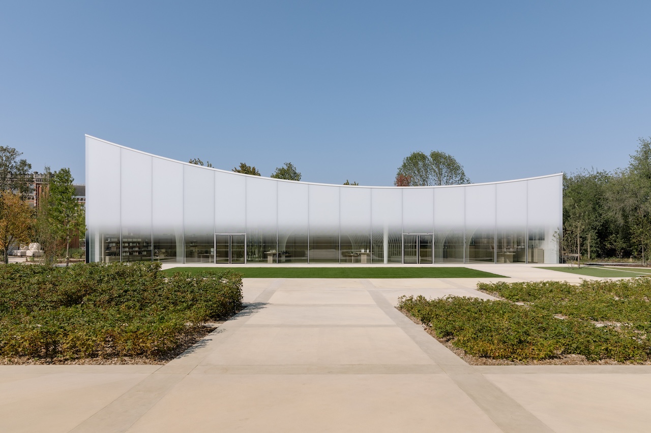
Japanese Architecture Meets Champagne at Maison Ruinart
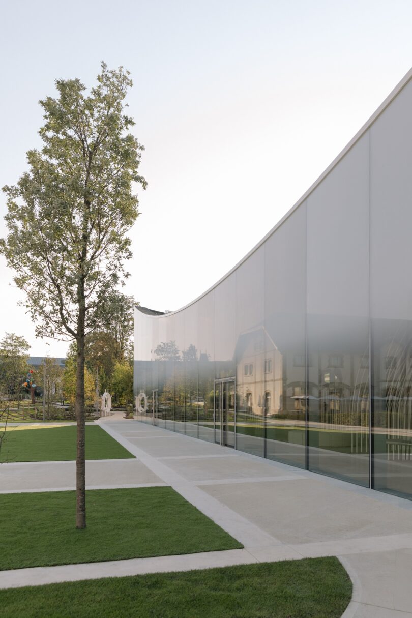
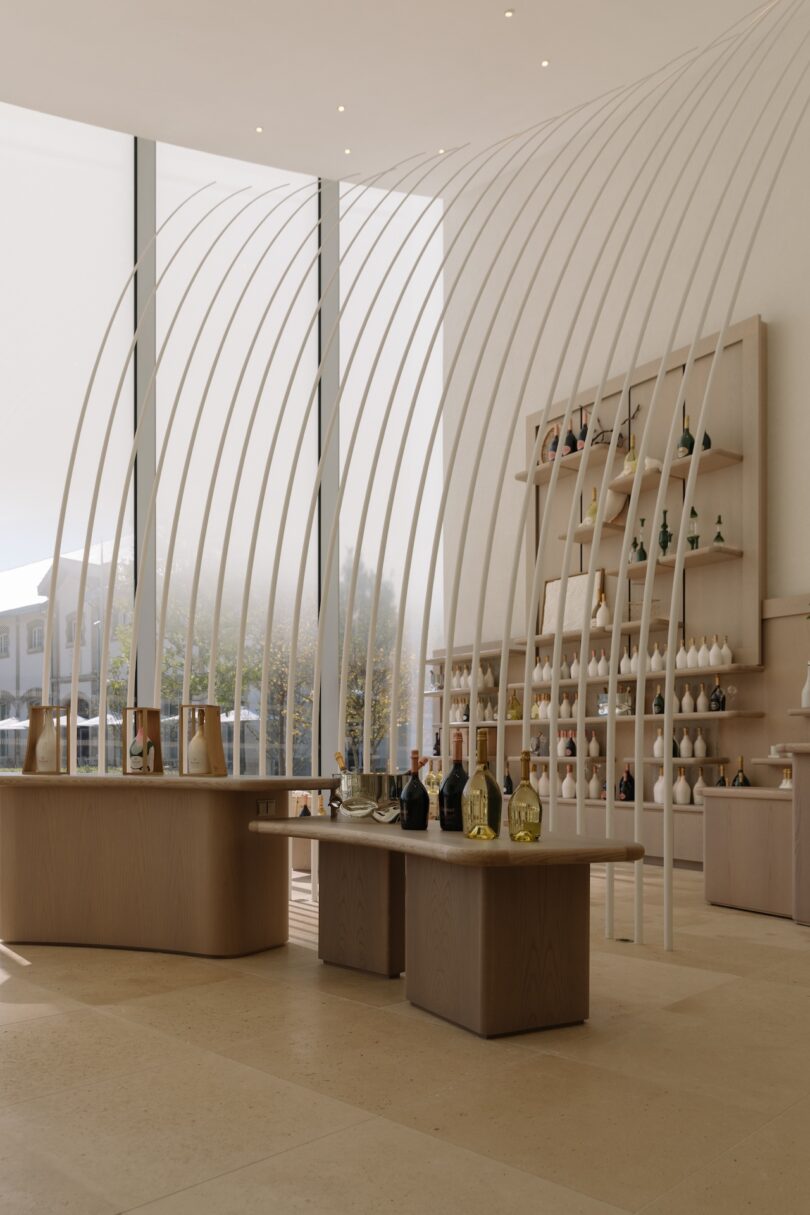
Like champagne itself, the revitalized Maison Ruinart in Reims, France emanates a sense of lightness and effervescence. After two years of meticulous restoration, this historic address, deeply rooted in the winemaking tradition of Champagne, has been reborn with a fresh, modern vision – one that captures the very essence of champagne through architecture, design, and landscape. Led by a renowned team consisting of Japanese architect Sou Fujimoto, landscape designer Christophe Gautrand, and interior architect Gwenaël Nicolas, the collaborative design includes a new pavilion of stone and glass, nestled within a public sculpture garden that champions local biodiversity.
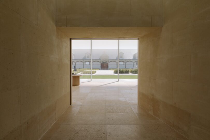
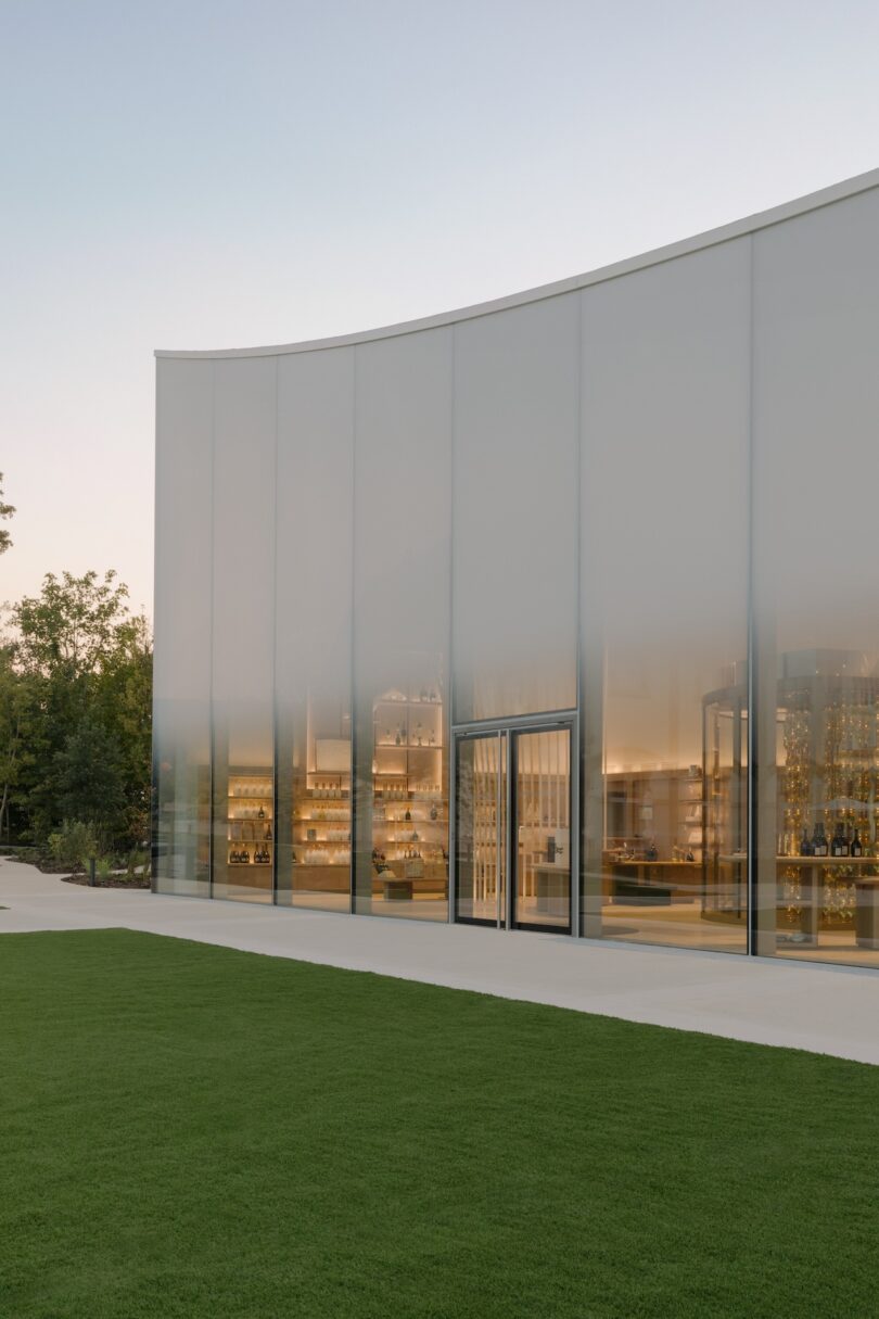
Fujimoto’s design draws inspiration from the lightness of champagne bubbles, forming an airy, asymmetrical structure with sweeping curves that echo the roundness of a champagne glass. Fujimoto goes on to say, “Through the pavilion’s bay window, facing the main courtyard, you see Maison Ruinart as if in a dream.” The pavilion’s transparent wall opens to the main courtyard, allowing visitors to view both the historic surroundings and the landscape beyond in one fluid scene. Inside, visitors experience a blend of light and shadow, moving through connected spaces that reflect the limestone-rich landscape of the region. With its winding paths and expansive glass, the pavilion offers a sensory journey that emphasizes the subtle beauty of nature.
The interiors blend textures and hues in a nod to Ruinart’s chardonnay vineyards, with details like green-toned upholstery and oak and beech furnishings that evoke petal-like forms. Floating glass bubbles by Atelier Barrois decorate the bar, adding to the dreamlike atmosphere. An intimate cellar beneath the pavilion offers a secluded tasting experience for enthusiasts, featuring Ruinart’s rarest vintages. “I wanted to strike the right balance between the history of an ageold Maison and a more contemporary perspective. Visitors are invited to plunge into the world of Ruinart, feeling both guided and free to explore as they please,” says interior architect Gwenaël Nicolas.
The restored site not only honors the heritage of Maison Ruinart but serves as a place for modern dialogue, welcoming artisans, artists, chefs, and visitors to engage in a shared celebration of culture, history, and the art of champagne.
Photography by Raul Cabrera.

HW and SW Architecture Approaches For Running AI Models – SemiEngineering
HW and SW Architecture Approaches For Running AI Models SemiEngineering
Source link
A wholesale power grab: how the UK government is handing housing over to private developers | Architecture
In any sane universe, something called the Housing and Planning Bill might safely be assumed to stimulate house building and improve planning. But the bill, which receives its third and final reading in the House of Commons today, does exactly the opposite of what it says on the tin. It will exacerbate the housing crisis and further enfeeble the planning system in ways we cannot yet comprehend.
The primary assault on social housing has been much discussed in these pages. The bill’s flagship measure – promoted at ownyourhome.gov.uk – will replace genuinely affordable homes with public subsidies for property investors. Rather than building homes for affordable rent, the legislation will force local authorities to build “Starter Homes” for first-time buyers. Capped at £450,000 in London and £250,000 in the rest of England, these homes will be unaffordable for people on average incomes in over half of the country, as Shelter has pointed out. Buyers will be free to sell their assets after five years at full market value, thereby minting a new generation of property speculators and removing any long-term benefit for future first-time buyers.
In addition to this, the bill will extend Right to Buy to housing associations, further depleting the number of homes for social rent. It will also compel local authorities to sell their highest value housing stock and pass the proceeds on to central government. Given that these high value areas are already subject to the greatest pressures on affordable housing, the effect will simply be to remove resources from the places that need it most. It will see British cities divided further into segregated enclaves for rich and poor.
The bill will bring an end to secure lifetime council tenancies, replacing them with two to five-year tenancies, and force those with a total household income of over £30,000 to pay market rents – hitting low-paid working families hardest.
In short, it is a raft of misguided measures that will only increase housing inequality. As campaign group Architects for Social Housing – demonstrating outside Parliament today – puts it, the bill is “an extremely subtle and duplicitous piece of legislation that in almost every aspect does something very different, if not the direct opposite, of what it is claiming to do.”
But the planning side of the bill has yet to receive the attention it deserves, in either the Commons or the national media. The proposed changes are shrouded in a haze of intentional ambiguity, but they threaten to eat away at the last shreds of the democratic process that safeguards how our communities are made, putting power instead in the hands of developers.
The most radical measure is the introduction of automatic planning permission in principle on sites allocated for development, without applications being subject to the usual rigours of the planning process. When the idea was mooted in October, ministers suggested it would initially be limited to proposals for housing on brownfield land but nothing in the legislation prevents it from being applied to any kind of development on any site.
“It is extremely dangerous,” says Hugh Ellis, policy director at the Town and Country Planning Association. “It could apply to all forms of development – for example, fracking could easily be given ‘permission in principle’ as part of a minerals plan. You can’t make a decision in principle about a site until you know the detail of its implications, from flood risk appraisal to the degree of affordable housing. Giving permission in principle would fundamentally undermine our ability to build resilient, mixed communities in the long term.”
Ellis fears that the bill marks the introduction of a “zonal” planning system, along US lines, whereby land is zoned for particular uses at a broad-brush scale and permission granted without the finer-grain negotiation of applications on a case-by-case basis, which has always defined the English postwar planning system.
“Zoning is one of the major contributors to the economic and social segregation of cities in America,” says Ellis. “If the government is going to make such a fundamental change to the planning system there needs to be an enormous amount of public debate and research. The future of British cities is at stake here, but there’s been no white paper and no public discussion at all.”
Lack of debate seems to characterise the entire bill, which saw several crucial amendments slipped in under the radar just before Christmas. In a change that opens the door for the privatisation of the planning system, communities secretary Greg Clark added a clause in December to allow the “processing of planning applications by alternative providers”. Rather than submitting a planning application to the local authority, it suggests that developers could assign a “designated person” to process the application for them instead.
Dr Bob Colenutt, planning expert at the University of Northampton, describes the move as “iniquitous”. “It will replace a public-sector ethos with a developer-led ethos,” he says. “The ‘designated persons’ are likely to be consultants who also work for the private sector, which introduces probable bias and reduces the public scrutiny trail. And it is very likely to reduce the right that the public has to make comments on planning applications.”
In the same way that developers’ financial viability assessments have been hidden from public view, it could mean that the entire planning process happens behind closed doors, with applications assessed by private consultants, paid for by the applicants.
“The question is, what problem is this really trying to solve?” asks Janet Askew, president of the Royal Town Planning Institute. “Local authority planning departments are critically underresourced, so if it’s a question of them being too slow then the government needs to increase their capacity, not strip it away further.”
Elsewhere in the bill, if local powers aren’t being handed out to the private sector, they’re being trampled by central government. Independent planning inspectors will be bypassed in a measure that lets the secretary of state intervene in the assessment of local plans. Another clause introduces a new power that will allow the government to produce plans for areas where it deems the local authority to be “failing or omitting” to do the work.
“It is all profoundly undemocratic,” says David Vickery, a recently retired senior planning inspector. “The bill represents a significant centralisation of powers by government to micro-manage planning, without thinking through the consequences. It reads like a panicked reaction to current low housebuilding rates, and the fact that the government doesn’t trust anyone other than itself to do the job. It proves that localism is dead.”
By further diluting the planning system in the name of “cutting red tape”, the government has picked the wrong target once again: the problem isn’t with planning, but with developers sitting on land. DCLG figures show that planning permission was granted for 261,000 homes in the year ending March 2015 (against the need for at least 240,000 homes per year), but only 125,110 homes were actually built. Put simply, 136,000 more homes were consented through the local planning system than were built by house builders. And, as a recent Guardian investigation revealed, the UK’s biggest developers have a land bank big enough for 600,000 new homes. It might be an idea to get them to use it. Instead, this bill represents a wholesale power grab, transferring both housing assets and planning powers from public to private hands in a drunken festival of deregulation.
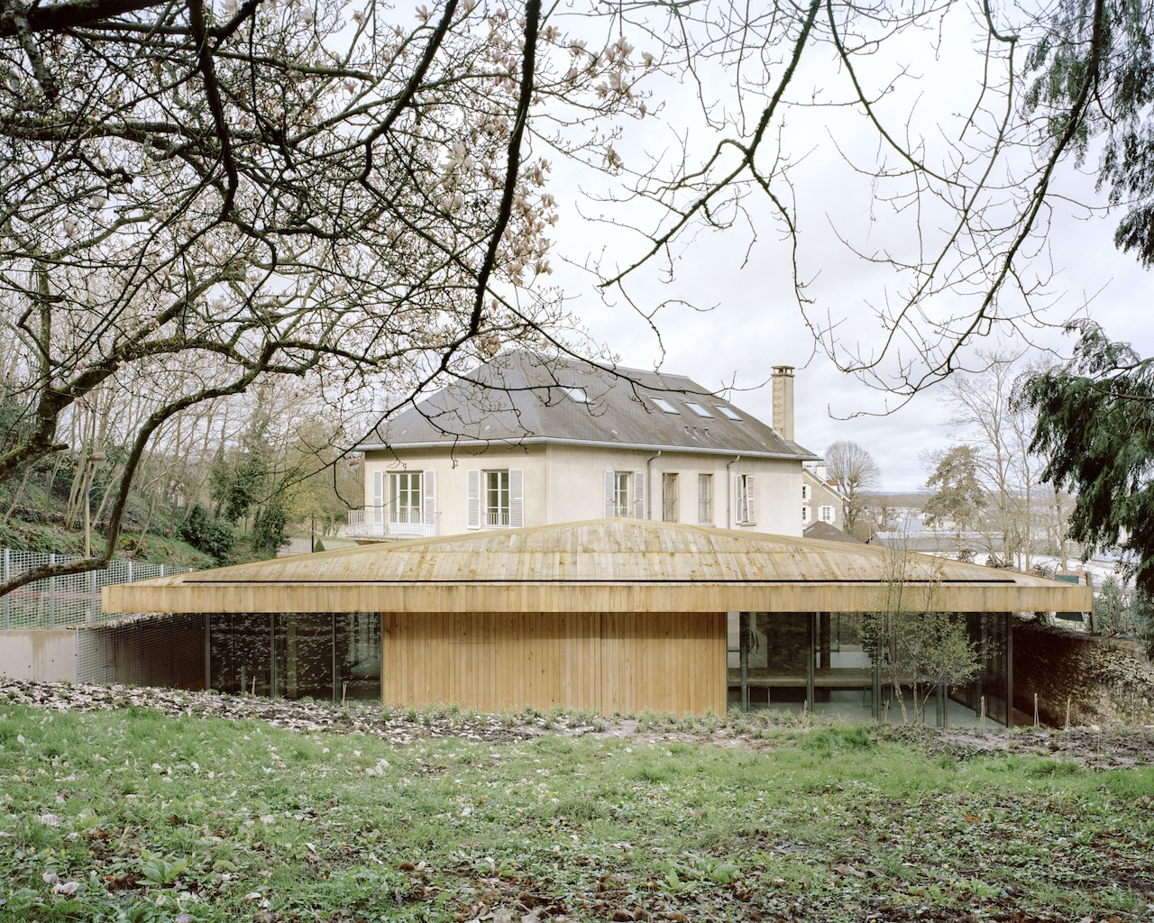
Office National des Forêts Blends Urban and Natural Settings
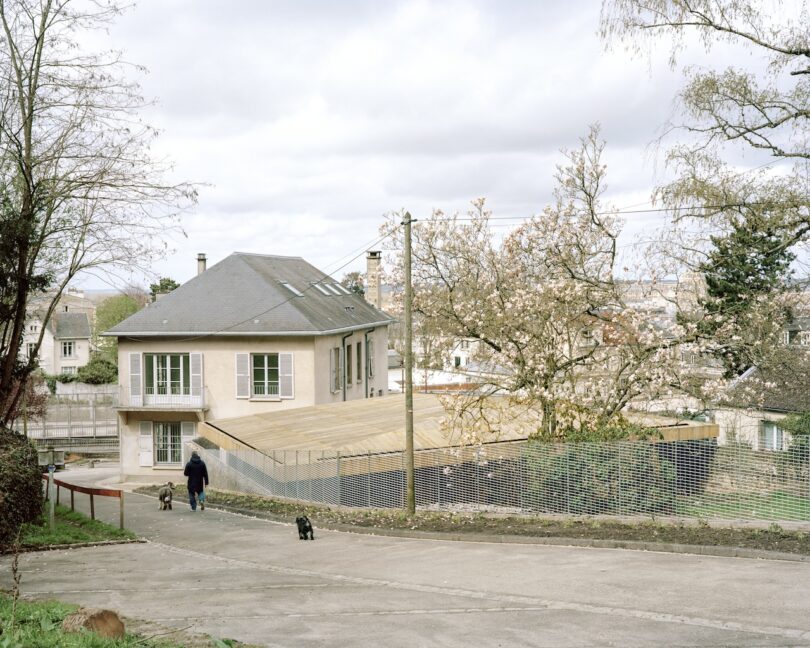
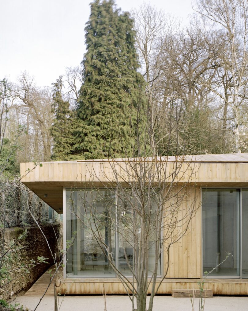
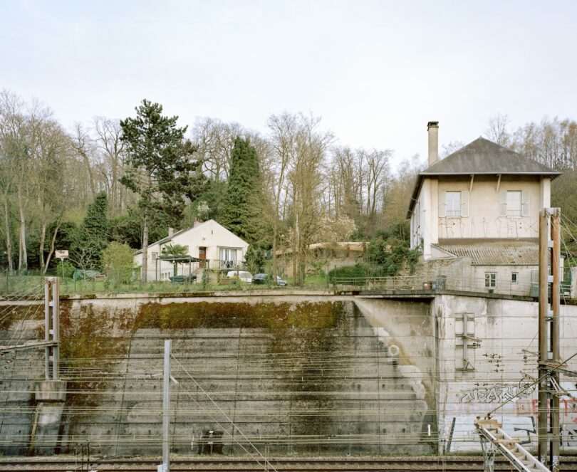
Thoughtful architecture has the power to reflect and reinforce the natural or urban environment of which it exists. Design, materials, and spatial planning come together to create buildings that harmonize with the landscape rather than dominate it. Whether seen in small projects such as Fallingwater or an extension to a public structure such as the Oslo Opera House, there will always be opportunity for architectural integration. In the case of the Office National des Forêts, designed by Atelier Delalande Tabourin, in Versailles, the expansion takes this concept to new heights. Positioned near a railway and bordering forest, the building embraces its setting, seamlessly connecting the built and natural worlds.
The structure reflects the activities of the forestry office, with its form and materials carefully chosen to blend into the forest context. The space invites both employees and passersby to engage with the building in an immersive way, with each element designed to highlight the craftsmanship involved in forest management.
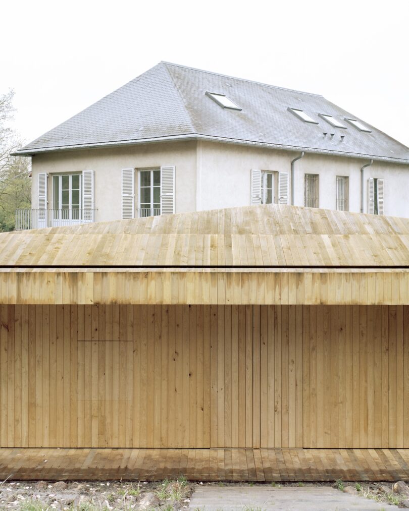
The roof and facade are constructed from locally sourced wood, specifically chestnut, which has been carefully processed to fit the project’s needs. The wood comes directly from the Versailles forest, and its preparation involved a meticulous timeline to accommodate the drying period required for the material.
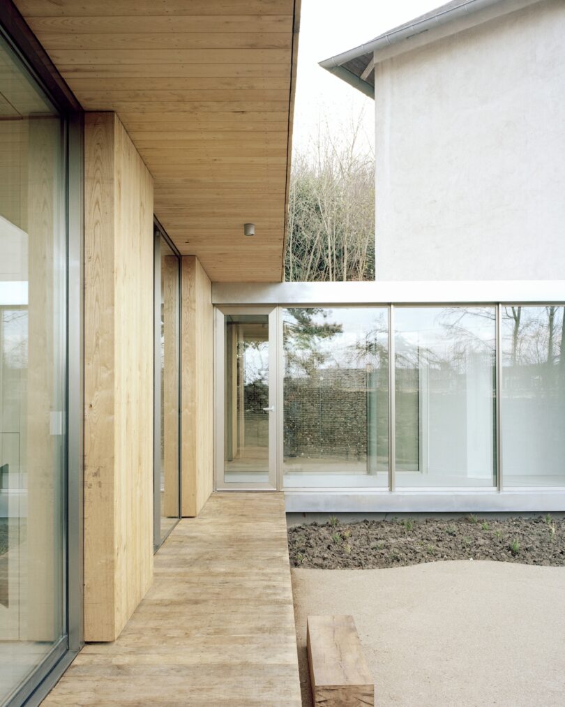
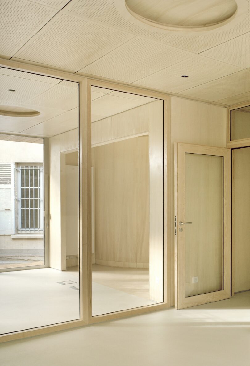
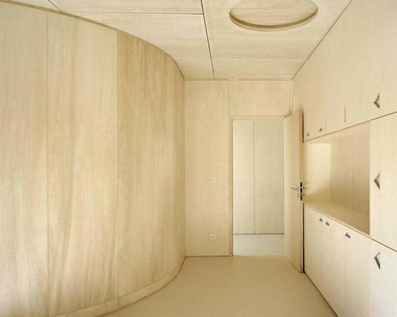
Inside, the pavilion is organized clearly, with spaces defined by solid wood blocks, guiding movement through darkened corridors that contrast with the natural light flooding the office areas. Custom-designed furniture and signage, made from wood, further connect the space to the forest environment, referencing the markings traditionally used by foresters.
The pavilion’s recessed position, combined with an extended wooden canopy, helps protect the interior from summer heat, while bio-sourced insulation and natural ventilation eliminate the need for artificial cooling. In the winter, a biomass heating system ensures energy-efficient thermal comfort.
For more information on Atelier Delalande Tabourin, visit atelierdelalandetabourin.com.
Photography by Maxime Delvaux.

Spread designs abstract covers for Japanese architecture magazine – Dezeen
Spread designs abstract covers for Japanese architecture magazine Dezeen
Source link
The ‘wearable dwelling’ – a coat for refugees that turns into a tent | Design
Design students have created a coat for refugees that can be reconfigured into a tent or a sleeping bag big enough to hold an adult and a child. The garment, which resembles a three-quarter length puffa jacket with a hood when worn, gives fresh meaning to the term “wearable technology”.
The brief was first suggested to the Royal College of Art in London by the clothing company Wall, and is the work of 10 master’s students between the ages of 22 and 26, who intend to crowdfund production costs and begin distributing the finished product by June.
The “wearable dwelling” is made from Tyvek, which is durable but extremely light and soft, permeable to air and water vapour and also rain-repellent. It is insulated with Mylar, a polyester film material also known as “space blanket” that is commonly used by marathon runners for protection. The garment has plenty of pockets for personal items.
“Lack of adequate, watertight shelter and warm, waterproof clothing is a major issue in refugee camps across Europe,” said Ruben van den Bossche, one of the students, who believes designers have their part to play in finding solutions to the problems faced by refugees in Europe’s biggest humanitarian crisis since the second world war. More than a million refugees arrived in Europe in 2015 – a four-fold increase on the previous year.“When people are forced to flee their homes due to conflict or persecution, they often leave with only the clothes on their backs and undertake what can be very long journeys in very difficult conditions,” said a spokesperson for the United Nations high commissioner for refugees.
“[We are] always looking at how design and technology can be used to improve our emergency response. With the proper testing, the RCA’s concept could be an innovative way to address the need for shelter for people who have lost everything.”
But Nick Harvey, of the voluntary health organisation Doctors of the World, expressed some doubts. “This garment, while being better than nothing, does not appear suitable for the harsh weather conditions many refugees face. It’s certainly not an adequate shelter for an adult and child,” Harvey said.
“It’s great that they’re trying to help. But it’s not going to be particularly effective if the temperature is minus 10 and you’re trudging through the Balkans. It looks more suitable for festival-going or possibly even for the UK homeless.”
The marketing plan for the coat is expected to include an option for festival-goers of “buy-one-for-yourself, give-one-to-a-refugee”, while its armless design is intended to prevent the garment being uncomfortable to wear in summer.
“I know that this could seem naive and fluffy,” said Harriet Harriss, senior tutor at the RCA. “But it was born out of a sense of powerlessness to help the people pouring out of Syria. As designers, we are doing what we can with what we have.”
Richard Parr on His Favorite Bag, Inspiring Art + More
It was clear that Richard Parr was destined to be an architect, putting his visions to paper early on. In elementary school, the left side of his English lesson book was filled with his stories – and a low mark for his less than stellar spelling. On the right side, however, were meticulous drawings of structures, just one example of his love of the built environment. “I drew buildings everywhere, and made them out of LEGO and clay,” Parr says. “I always enjoyed playing with and making spaces.”
His self-education included visits to places in Italy and England steeped in history. When Parr stepped into Basil Spence’s Coventry Cathedral, it was a seminal moment, and he still has the guidebook from that day. Completed in 1962, the new cathedral was built to replace the 14th-century St. Michael’s Cathedral, destroyed in an air raid during World War II. Spence took elements of the past to reinvent the future. For Parr, it represents what he constantly strives to achieve.
Richard Parr Photo: Mark Cocksedge
The architect founded Richard Parr Associates three decades ago, with an emphasis on timeless spaces, created by merging craft traditions and technology. He also appreciates hospitality, and can often be found cooking and entertaining. In the London studio, dubbed the People’s Space, there’s even a bar and a main kitchen. The staff regularly share meals and conversation because they consider breaking bread the ultimate act of giving.
Parr divides his time between two locations where his life and studios are. While he’s energized when working in the city, he disconnects as soon as he arrives at his farm in the Cotswolds. He takes every opportunity to enjoy nature and tend to his kitchen garden.
Parr regrets that he missed out on both A-level art and a foundation year, and he would like to explore different mediums, particularly painting. He’s content though, and like all exceptional leaders, he knows which role each person will thrive in, himself included. “I like to think that I have tapped into most of my usable talents, and seasoned enough to recognize where I am not going to flourish,” Parr notes. “Even within the practice, I am happy to delegate where others can do better than me.”
Today, Richard Parr joins us for Friday Five!

República Dominicana, Facultad de Ingeniería y Arquitectura (FIA), 2022, oil, beeswax, and powdered gold pigment on canvas
Rogelio Báez Vega, whose work I encountered in NADA in Miami in 2022. The pieces are depictions of modernist buildings. The modernist movement is an area of fascination and interest to me. The impact of the ‘International Style’ and its application across the world is a theme that I engaged with when discovering Rogelio’s work. I enjoy seeing the artist exploring the relationship this architecture has in different geographies and politics and I have several works in my collection from diverse areas of the world, exploring the societal dialogue with a built environment that has become universal. As with anything the universality becomes local and it’s the conversation in specific context that interests me.
Many years ago, I encountered the designer Massimo Alba from Milan. His annual collections are a treat and his approach to fashion… the fabrics, colors, texture and cut marries with my own love of comfortable and understated ‘sprezzatura.’ His mandarin collared jackets, which are as European as anything else have become the core of my wardrobe. They are more than they seem, with (like everything he designs) an understated quirkiness that combines the relaxed style of Italian tailoring with interesting and clever fabrics. I wear his linens in summer and his tweeds in winter, velvets, and cord as well. Every year I visit his Brera showroom and make an annual addition.

Photo: Courtesy of The Modern House
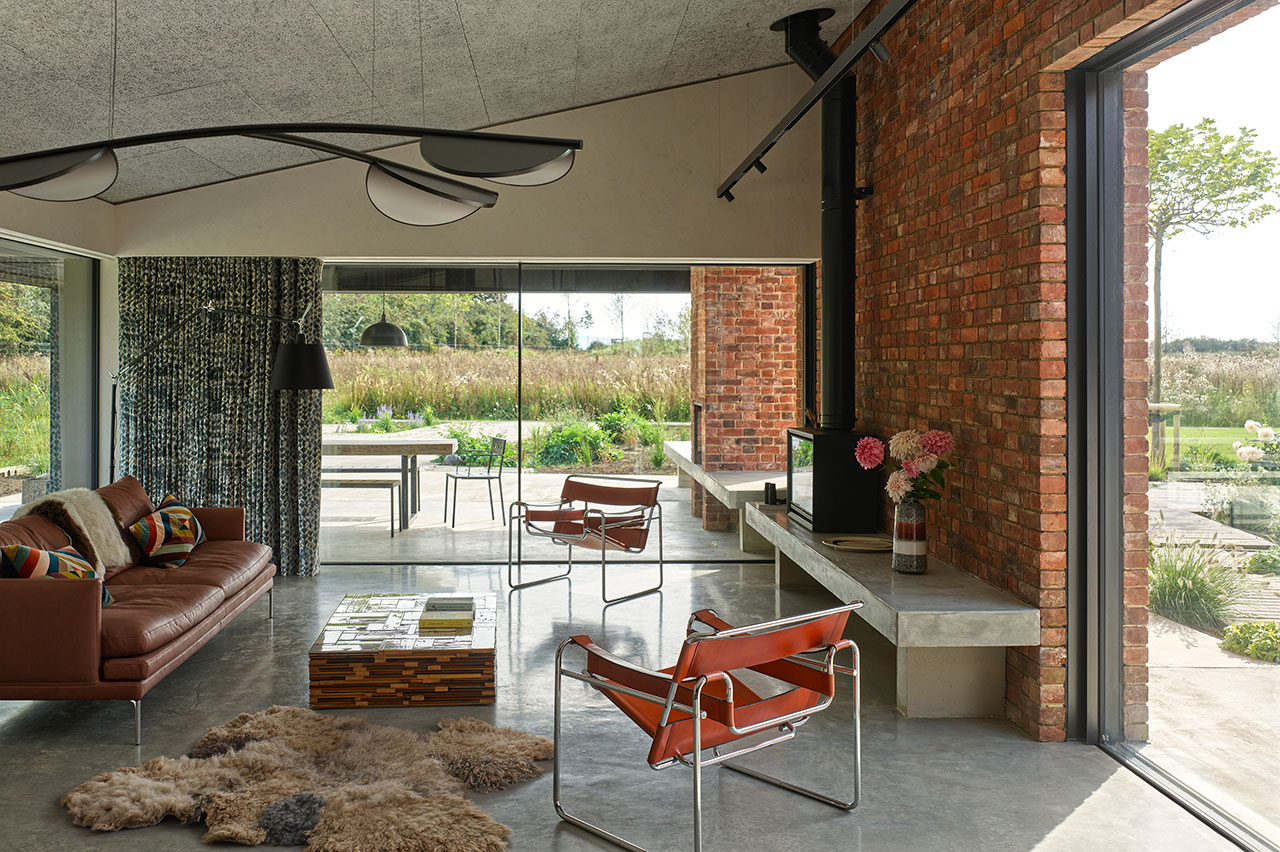
Pep and Cuca’s gallery embodies and combines everything I love. Firstly, the very existence of this gallery in Tetbury is a joy and 10 minutes’ drive from home. The combination of contemporary art, 20th century furniture, some extraordinary antiques from both Spain and the British Arts and Crafts movement means I could happily own most of what they have in the gallery! I spent many years living in Spain and the fusion of contemporary architecture with history is something I learnt there and why their choices resonate and works so well for me. Among a number of pieces I have acquired from them are works by Chillida, the Mallorcan artist Guillem Nadal, and a number of pieces of furniture. I bought an Eames coffee table from the 1940s, which is one of the most enjoyable pieces I own and used daily.
My Porter-Yoshida bag goes with me everywhere. It’s the perfect design and could have been tailored for me. I never lose anything into it yet I throw my life into it! It holds everything from my laptop to crayons and is a smart but relaxed non statement piece.
I have chosen something garden related. Gardening or my garden is my escape and where hours of time are expended. My kitchen garden at home fills what was once a concrete yard between my house and my studio. I can find something to eat in it on every day of the year. Spring time seed buying is a ritual and I discovered Vital seeds a few years ago. They sell organic seed and I have a great success rate with everything that I have bought from them.
Works by Richard Parr:
Photo: Gilbert McCarragher

Architecture of Cities: Peripheral Journeys – CounterPunch
Architecture of Cities: Peripheral Journeys CounterPunch
Source link
Growing pains: how will London house 1.5 million more people by 2030? | Architecture
Walking past a soggy piece of A4 paper, crumpled among cigarette butts and dog urine at the bottom of a lamp-post, is the closest most people come to any interaction with the British planning system. The nosy might stop to uncurl the wind-battered notice, jot down the reference number and look up the application online, where, once they have navigated pages of documents, they might be lucky enough to download a file that shows what is being proposed – if they can decode architectural drawings, that is.
For those who aren’t prepared to go to such lengths, the first warning that a 40-storey tower is being built at the end of their street often comes in the shape of the tower itself.
The opacity of the planning system has long fostered a destructively combative culture on both sides of the building site fence. Developers go to increasing lengths to obscure the reality of proposals, organising token “consultation” sessions at times when few apart from the retired can attend, and concealing their calculations in pages of viability assessments. Opposition groups, meanwhile, have become ever more militant in their attacks on the developers, staging marches, protests and public meetings with the crazed fervour of a lynch mob.
Communities understandably feel cut out and disenfranchised from the shaping of their cities as the march of luxury flats continues, and developers feel they’re being held over a barrel, forever cast as villains while being forced to contribute to local authority coffers over and above what they deem fair. And with resources stretched to breaking point, councils are resorting to similar measures, as if to say “we’re not guilty, we’re being forced to do it”.
In Hackney, east London, a bold hoarding erected around an estate regeneration project declares: “28 new council homes for social renting, 39 for shared ownership and eight for private sale to help pay for them all in the absence of government funding”.
It is an unprecedented statement for a local authority to make, joined a little further south by another council-sponsored billboard warning of “A dark future for Shoreditch”. With big black and red letters giving it the look of a horror movie poster, it outlines exactly why the borough is opposed to controversial plans to develop the Bishopsgate Goods Yard, which could be the site for a cluster of 12 buildings of up to 47 storeys, where one-bed flats are likely to go for more than £1m.
“We’ve had the decision taken away from us,” proclaims the poster, in reference to the mayor of London, Boris Johnson, calling in the project to decide for himself, “but it’s not too late for you to have your say.”
Perhaps people could have had their say a little earlier, rather than the developer wasting millions on professional fees and the council now spending taxpayers’ money on a campaign to stop the project so far down the line – if they had been allowed to have input before the designs were already fixed.
These issues are the nub of a new report produced by the mayor’s Design Advisory Group, an independent body of experts from across the architecture, planning and property sectors, on tackling London’s growth up to 2030 – by which time an extra 1.5 million people will need to have been accommodated in the capital. Unlike the pages of generic platitudes that usually emerge from such groups, Growing London is a breath of fresh air, addressing longstanding flaws in the development system and weaknesses of the London Plan with commonsense recommendations that any new mayor would do well to take up.
The report is ambitiously broad in scope ranging from rethinking density and policy for tall buildings to how suburbia could be intensified, and the need for better understanding of the total lifetime maintenance costs of new buildings. There are good recommendations on breaking up large parcels of publicly owned land into smaller development sites, to give smaller house-builders a look-in, and on encouraging local authorities to share expertise in leading development projects themselves. There is important advice about measuring the qualitative impact of planning policies, given the strange new urban forms often spawned in a developer’s vain effort to tick all the boxes.
The most important thrust of the report, which should be embraced by the next administration, is about finally cracking open the byzantine development process in London, laying it out under the spotlight for all to see. For one thing, it advises that the feeble A4 planning notice should be rethought – perhaps a picture of the proposal might help? – and that it could be linked to a virtual 3D model, so you could see what was being proposed in its wider context. Astonishingly, most planning authorities still don’t have their own in-house virtual models, or request the submission of 3D models with big planning applications, meaning the cumulative impact of neighbouring developments can go critically ignored.
Building on this, the report stresses that public engagement in development needs to become less reactive and move to a much earlier stage in the process: consultation should inform the principles of any development before they are fixed, rather than simply present a finished design to be voted on. It also demands greater transparency and accountability over section 106 agreements, which mitigate impacts of schemes, and the viability appraisals that underpin them, to help reconcile the mismatch between communities’ demands and the reality of what developments can deliver.
If the potential wider benefits of a scheme are spelled out, at least people can judge whether it is in their interests, rather than resorting to a nimby knee-jerk no.
If London’s population is to grow by as much as 100,000 people every year – adding the equivalent of a town the size of Bath on an annual basis – then Londoners have to come to terms with the realities of what that kind of growth means. Opening up the planning process to full scrutiny, with choices presented in a way that people can actually understand and feel part of, is the crucial first step.


