Family Photo archive, a new addition to the Library at the Bishopsgate Institute
Lucy feeding the pigeons in Trafalgar Square in 1981
There is to be a place in London where old family photos will be collected for researchers to view. News in from Spitalfields Life the wonderful daily blog by the Gentle Author (check it out!) tells us that Stefan Dickers, Archivist at the Bishopsgate Institute is offering a home to unwanted albums and family photographs, where they will be safely stored as an archive. It is to be called the London Family Photo Archive . He is happy to take receipt of digital copies of photographs if you wish to keep the prints.
“We are looking for family and personal photos of everyday life, no matter if you have lived in London since birth or are a recent arrival to the city,” Stefan explained to me, “We are also looking for photos that depict Londoners on day trips and holidays outside of the city.”
If you might wish to contribute albums or pictures and would like to know more please contact library@bishopsgate.org.uk
This sounds like a wonderful resource in the making….and look at what else they have!
Since opening in 1895, Bishopsgate Library has built up through its collecting policy a record of the development of photography in the capital, alongside it’s ever growing collections of books, maps, directories and press cuttings. The emphasis is on the everyday life of London and the Library has specialised in collecting street photography and social and cultural images of London, rather than portraiture or people. The collections are also not limited to famous photographers.
Library Collections cover London History, Labour and Socialist History, Freethought and Humanism, Co-opertaion, Protest and Campaigning, Parliamentary profiles and they hold the Lesbian and Gay Newsmedia archive
The ten best films of … 1933
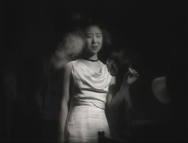
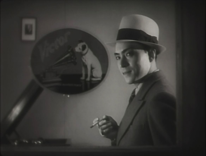
Dragnet Girl (1933).
Kristin here –
Due to health problems, we have been reposting older entries lately and will continue to do so. Still, I could not skip this year’s contribution to the inexplicably popular series of ten-best lists for ninety years ago. Previous lists can be found here: 1917, 1918, 1919, 1920, 1921, 1922, 1923, 1924, 1925, 1926, 1927, 1928, 1929, 1930, 1931,and 1932.
Last year’s list was easy to fill with marvelous films. Surprisingly, 1933 proved to be a thin year for masterpieces. The major auteurs of Hollywood and France created relatively minor films and German filmmakers were busy finding safe places to live and work. In short, there were some obvious films to head the list, but there are some titles here that I would include in a stronger year.
Fortunately one of the greatest filmmakers hit his stride in 1933. Yasujiro Ozu made three films that could be among the top ten. I usually don’t put two films by the same director on these lists, but I’m including two of his (sorry, Woman of Tokyo). Earlier Ozu films that featured on these lists can be found in the 1930, 1931, and 1932.
Dragnet Girl
2023 has been the 120th anniversary of Ozu’s birth and the 60th anniversary of his death. Retrospectives and exhibitions internationally have no doubt widened fans’ awareness of his earlier films. For decades almost none of his films made before Late Spring (1949) were much known outside Japan. Ozu’s gentle family dramas were so familiar that few would have believed that he began with genre films: student comedies, family comedies, salaryman comedies, and even gangster films. Now, fortunately, his entire surviving output is available on DVDs and Blu-rays, though sometimes not in versions with English subtitles.
The Criterion Collection’s Eclipse series brought the best of the very early films to DVD, including the two Ozu films on this list.
Film buffs familiar only with Ozu’s late films might well ask, could Ozu make a good gangster film? Actually, he could make a great one. Dragnet Girl is one of his early masterpieces.
Ex-boxer Joji is a small-time thug, living of his mistress, Tokiko. An aspiring young boxer and wannabe gangster, Hiroshi, idolizes Joji and spurns his sister Kazuko’s pleas to stay in school. Joji falls for Kazuko, and Tokiko finds that she likes the girl and wants to emulate her by persuading Joji that they should leave their lives of crime. But there’s one last job …
The style is quite noir, and Ozu has fun playing with the various Nipper figures and decals in the music shop where Kazuko works (see top). And Kinuyo Tanaka, best known in the West for tragic roles in Mizoguchi films, does quite well as a gangster’s moll (above).
Dragnet Girl is available on DVD in the Criterion Collection’s “Silent Ozu–Three Crime Dramas” and streams on The Criterion Channel.
Passing Fancy
As part of the slow discovery of Ozu’s work outside Japan, Western audiences finally got a glimpse of his early work when I Was Born, But … became available. As wrote last year, it “may be the one where he achieved the perfect balance of humor and poignancy that characterizes so many of his best films.” Or maybe it was Passing Fancy that struck that balance perfectly.
In a way, Passing Fancy reverses the premise of I Was Born, But …. In the earlier film, two boys become petulant and rebellious when they realize that their respected father is a mediocre salaryman taking orders from a wealthy boss and even playing the clown to entertain party guests for the boss. The parents realize the sadness of their situation but manage to handle the boys with understanding.
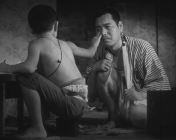
In Passing Fancy, the father, Kihachi, is an illiterature, carefree worker who approaches his duties as a single father to his bright son Tomio. Tomio acts as the parent, dragging his father out of bed, dressing him, and seeing him off to work. Tomio strives for an education, insisting on doing his homework when Kihachi tells him to go out and play. The two get into a serious argument, and their reconciliation (above) is one of Ozu’s most poignant of many poignant scenes.
As David says in his book on Ozu, Passing Fancy is more focused around complex characterization than his other early films. The secondary characters include Harue, an unemployed young woman, whom Kihachi briefly believes he can woo despite being considerably older (the “passing fancy” of the title). There is Kihachi’s cynical friend Jiro, who accuses Harue of being a gold-digger and rejects her growing love for him. The plot focuses on the characters and their changing attitudes, especially Kihachi’s alternation between fits of fatherly responsibility and selfishly neglectful behavior.
Passing Fancy is available on DVD in the Criterion Collection’s “Silent Ozu-Three Family Comedies” and streams on The Criterion Channel. The same link leads to David’s discussion on editing in Passing Fancy in our “Observations on Film Art” series. A PDF of his book, Ozu and the Poetics of Cinema, is available for free here.
Design for Living
Ernst Lubitsch’s Trouble in Paradise (1932) is generally considered one of his very best films. It tends to put Design for Living in its shadow. Still, this Ben Hecht adaptation of a Noel Coward romantic comedy is nearly as good, with three marvelous stars–Gary Cooper, Frederic March, and Miriam Hopkins–and enough witty dialogue for three features.
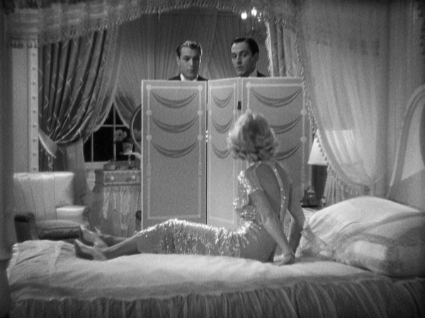
It’s also as risqué as anything Lubitsch did, narrowly missing the introduction of the Code in 1934. The three leads, Tom Chambers, a painter (Cooper), George Curtis, a playwright (March), and Gilda Farrell, a commercial artist (Hopkins) meet on a train in France and soon move in together. They swear a gentlemen’s agreement that there will be, as Gilda forthrightly says, “No sex.” This doesn’t work out, as Gilda has affairs with both, one after the other. Eventually they reunite and swear another gentlemen’s agreement–which clearly is leading to a menage à trois.
Design for Living is interesting to contemplate in relation to the Code’s dictates that characters who transgress moral or legal strictures must be punished by the film’s end. Most obviously here the three characters end up settling into a comfy romantic trio. Beyond that, though, Gilda’s desire to become a mother of the arts by guiding the pair’s unsuccessful careers has paid off spectacularly by the end. Her pitiless criticisms of their work (“Rotten!”) goad both of them to fame and fortune. The only one punished by the end is the wealthy advertising executive Max Plunkett (Edward Everett Horton), whose brief, straitlaced marriage to Gilda ends disastrously. The Lubitsch Touch indeed.
Design for Living is available on DVD or Blu-ray from The Criterion Collection and streams on the Channel.
The Testament of Dr. Mabuse
As is well known, Fritz Lang, despite not being Jewish, left Germany for France and ultimately Hollywood in 1933 when Hitler came to power. His last German film until he returned in the late 1950s was The Testament of Dr. Mabuse. The film was banned immediately, with the German version having its premiere in Budapest. A French version, also directed by Lang but with different actors, circulated in Europe and the US, and various recut versions were circulated thereafter.
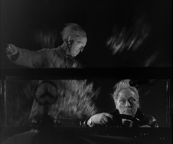
A sequel to the two-part serial Dr. Mabuse, der Spieler (which was on my top-ten list for 1922), Testament took a very different approach to its titular villain. Now Mabuse has become insane and is incarcerated in a mental institution. There he obsessively scribbles down plans for a universal reign of crime. To escape the institution, his spirit enters the body of Dr. Baum, his psychiatrist (above), who becomes his surrogate in leading the gangsters who carry out Mabuse’s plans.
The sequel is not quite up to the original, in large part because the menacing Rudolph Klein-Rogge, who played Mabuse in that film, is barely present here. We see him briefly in his cell and occasional in some sort of spirit form, but Dr. Baum is not nearly as fascinating as a surrogate Mabuse.
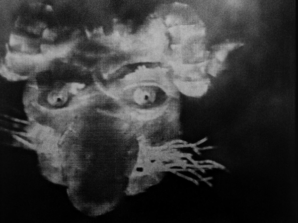
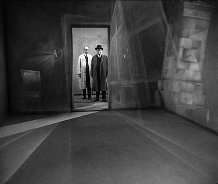
Stylistically, however, Testament is pure Lang, with high long shots along dark, deserted streets, art-deco interiors, and a spectacular fire at a gas factory. There’s also a justly famous scene of an assassination from one car to another on a crowded street. Lang also seems to bid good-bye to Expressionism, with a subjective shot from the point of view of an asylum patient (see bottom).
The Testament of Dr. Mabuse is available on DVD from The Criterion Collection and streams on the Channel. The DVD set includes the French version and a restoration of the German version missing three minutes of the original running time.
Zero for Conduct
Zero for Conduct has been another victim of censorship. Jean Vigo’s depiction of the miseries in a school for mainly working-class boys and especially the rebellion that some of the foment was too much for the authorities. It was only discovered after World War II, being released in the USA in 1947 and being taken up by cinephiles and the New Wave filmmakers in France.
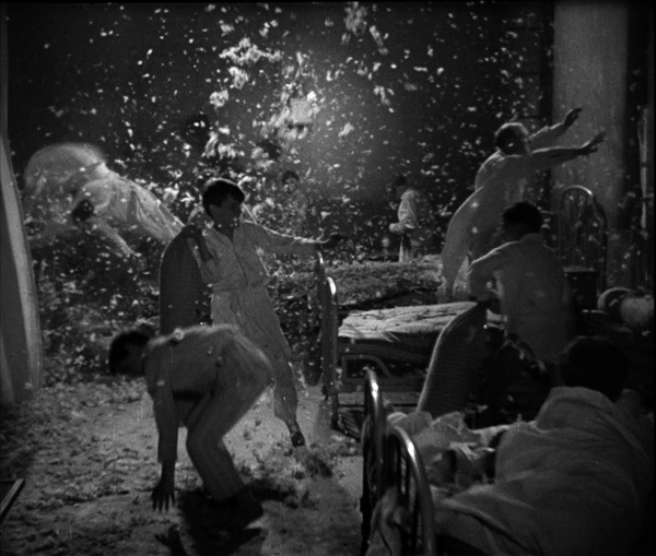
I first saw the film as a graduate student. It was a muddy, gray print that did not reveal to me what all the fuss was about. Modern restoration has revealed the details and the luminosity of the cinematography by Boris Kaufman, as in the nighttime dormitory rebellion (above).
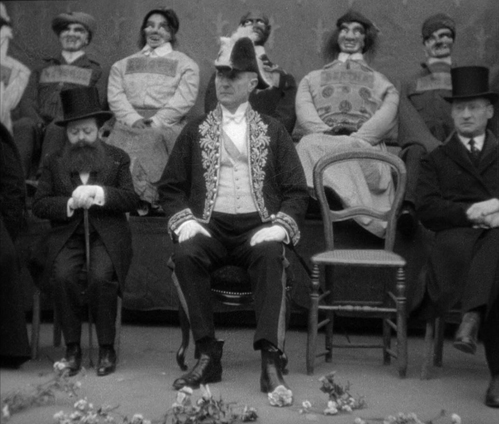
Vigo is sometimes referred to as a surrealist director. There are moments in Zero for Conduct that could be described as surrealist, as when the one kind teacher Huguet, draws a carticature while doing a hand-stand or the life-sized dummies that represent the attendees at the school fête where the rebellion breaks out. On the whole, however, the odd touches seem more to represent the way the children see the world, for the film is told largely from their vantage points.
Zero for Conduct is available in its restored version on DVD or Blu-ray in the set “The Complete Jean Vigo” from The Criterion Collection and streams on the Criterion Channel.
A Night on Bald Mountain
It’s not often that a completely new animation technique is introduced, but it happened in 1933. Claire Parker and Alexander Alexeieff had invented the pin board or pin screen method. It involved a perforated board three by four feet, with hundreds of thousands of headless pins stuck through it. By pushing pins forward selectively and casting a raking light across the board, they could create images that resemble moving engravings.
A Night on Bald Mountain is set to Mussorgsky’s tone poem. There is no narrative, only a series of unconnected, disturbing images pass quickly across the screen, often morphing from one shape to the next. The result, as the above images suggests, is eerie indeed.
Given the labor-intensive work required on each film, the pair produced a small number of animated shorts across decades, supporting themselves by making many advertising shorts. The Wikipedia entry on Alexeieff has an excellent summary of the couple’s career and an extensive filmography.
Most prints of A Night on Bald Mountain are too dark. A restored version is included in Flicker Alley’s essential DVD/Blu-ray collection, “Early Women Filmmakers: An International Anthology.” It streams on The Criterion Channel.
Footlight Parade
1933 was a remarkable year for the series of Warner Bros. musicals famous for their numbers staged and choreographed by Busby Berkeley. No fewer than three major titles were released that year: 42nd Street, Gold Diggers of 1933, and Footlight Parade. I can’t put all three on the list, and I suspect the general opinion is that Footlight Parade is the best of the entire series.
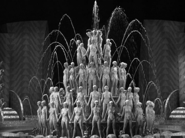
It’s far livelier than the others, with the crazy premise that a company forms a service delivering live stage prologues to movie theaters. The result is a frantic race to get from one theater to the next. It has James Cagney, whose fast patter and unique, jittery dancing style injects an energy that offsets the bland Dick Powell. It has a string of big numbers, from “Honeymoon Hotel” to “By a Waterfall” to “Shanghai Lil,” all showing Berkeley at his flamboyant best.
Footlight Parade is available in Blu-ray and other formats from Warner Bros. The image above was taken from a DVD in “The Busby Berkeley Collection,” a bargain boxed setwith five films and a documentary.
Duck Soup
Speaking of surrealism, the Marx Brothers ended their five-film contract at Paramount with what is widely considered their best film, Duck Soup, directed by Leo McCarey.
At Paramount, the brothers were allowed to create messy scenarios without the logic and unity dictated for most Hollywood films–including those made at MGM under the dictates of Irving Thalberg. The result is a series of comic set pieces loosely held together by a plot involving the tensions between two Ruritanian countiries, Fredonia and Sylvania.
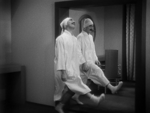
The most famous of these set pieces is the mirror scene, where Pinky (Harpo), dressed as Firefly (Groucho), struggles to hide the absence of a broken mirror by mimicking his actions perfectly. Rather than confronting Pinky, Firefly devises ever more elaborate movements to reveal the ruse, inevitably copied flawlessly by Pinky (above). Other comic highlights that have nothing to do with the plot involve Pinky and Chicolini (Chico) running a peanut stand and carrying on a feud with the neighboring lemonade stand run by the master of the slow-burn, Edgar Kennedy.
This feud foreshadows the battle scene at the climax of the film. Staged entirely in the Fredonia headquarters, the action becomes increasingly nonsensical, with Firefly’s military outfits changing at frequent intervals and madcap dispatches coming in from the front.
Duck Soup also has the advantage of not including either of the hitherto obligatory harp and piano solos by Harpo and Chico. There are no such “serious” interludes or subplots involving young lovers, as there would be in A Night at the Opera and other later films. It’s the Marxes’ only film with unadulterated crazy humor throughout.
Duck Soup is available on Blu-ray and other formats here. The same range of formats are available for “The Marx Brothers Silver Screen Collection,” which contains their five Paramount films.
King Kong
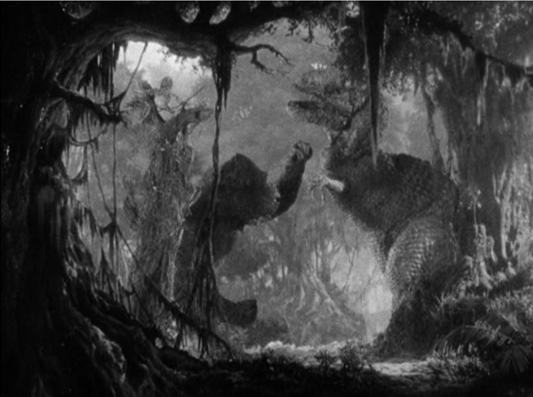
King Kong was released only a few years after Universal had seemingly identified ed the horror genre with vampires, sub-human monsters, and old dark haunted houses. Kong was different, a monster that could be sympathized with. Viewers could attribute human feelings to Kong as he saves Ann Darrow from a tyrannosaurus (above). As documentary filmmaker Carl Denham remarks, the giant gorilla’s affection for Ann turns the plot into a beauty-and-the-beast tale.
The film also added a touch of novelty by having Kong climb the Empire State Building, which had been opened to the public only two years earlier.
The impact of the film was no doubt enhanced by Max Steiner’s revolutionary musical track. It used leit motifs and a large orchestra, and the music played for a larger portion of the film than was usual in early sound films.
King Kong also expanded the methods of special effects available to filmmakers with its extensive use of Willis H. O’Brien’s puppet animation for Kong and the dinosaurs of Scull Island. (As I discussed in a previous post, O’Brien’s puppet animation was used extensively eight years earlier in the 1925 version of The Lost World.)
King Kong is available on Blu-ray from Warners. My image is from the out-of-print “Two-disc Special Edition” on DVD.
The Three Little Pigs
Despite being a major force in the American film industry by this point, Walt Disney has been little-represented in my lists. So far only The Skeleton Dance (1929), the first of the Silly Symphonies, has represented his output. The Three Little Pigs wasn’t a technical milestone in Hollywood animation. The first three-strip Technicolor short was Disney’s bland Flowers and Trees, which won the 1932 Oscar for an animated film (the first years this category was included). The Three Little Pigs won for 1933. In 1994 a large group of professional animators voted it number eleven on a list of the fifty greatest animated shorts. (An interesting list available here.)
Obviously people like the film a lot. It grossed ten times its production cost. It’s considered a classic. It has all the advantages of the best Disney shorts–beautiful color, fast action, and a catchy song, “Who’s Afraid of the Big Bad Wolf?” It’s also quite funny. The framed pictures on the walls of the three pigs’ houses are easy to miss, but they characterize each pig cleverly.
The Three Little Pigs is available from multiple sources. My frame was taken from the “Walt Disney Treasures: Silly Symphonies” DVD set. The “Treasures” series, recognizable by its aluminum cases, is out of print and hard to find, though there are a few copies available on eBay. (The same version has been posted on YouTube, but beware, it is distinctly out of focus.)
The Testament of Dr. Mabuse (1933).
This entry was posted
on Sunday | December 31, 2023 at 4:42 pm and is filed under Film comments.
Both comments and pings are currently closed.

A Bay Area Home Merges Architecture, Art, and Outdoor Living
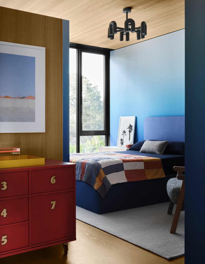
The Bay Area Home, designed by the Olson Kundig architecture firm with interiors by Nicole Hollis of NICOLEHOLLIS, stands as an elevated display of modern architecture and curated interiors, carefully crafted to promote the family’s active and art-filled life. Situated in an established San Francisco Bay Area neighborhood, the house is a relaxing haven amid city life, blending indoor and outdoor living with the help of mature oak trees, reflective water features, and expansive views of curated gardens.
Architect Tom Kundig’s design is a study in contrasts, balancing formal and casual spaces within a single structure. The home, which spans multiple zones, includes an area for entertaining guests and a more intimate section dedicated to family life. These distinct zones not only give the house a sense of openness but also foster a feeling of closeness and warmth. As Kundig explains, “This project organizes a pretty big home around two very different functions: formal spaces for hosting and entertaining, and much more casual family spaces.” This dual-purpose design is bolstered by the home’s close connection to nature, achieved through expansive glass walls and kinetic elements that blur the lines between the indoors and outdoors.
The entrance of the home begins with a dramatic statement: a black steel bridge suspended over a lightwell, leading to a bronze pivoting front door that opens onto an art-filled entryway. Large walls throughout the house showcase the family’s impressive art collection, featuring works from artists such as Oscar Murillo and Alma Allen, while oversized glass windows offer uninterrupted views of the lush surrounding landscape.
An Olympic-sized swimming pool lays along the axis of the hovering primary suite, an extension of the covered outdoor living space. On the opposite side of the pool is a cabana, which features a sauna, cold plunge, and outdoor gym.
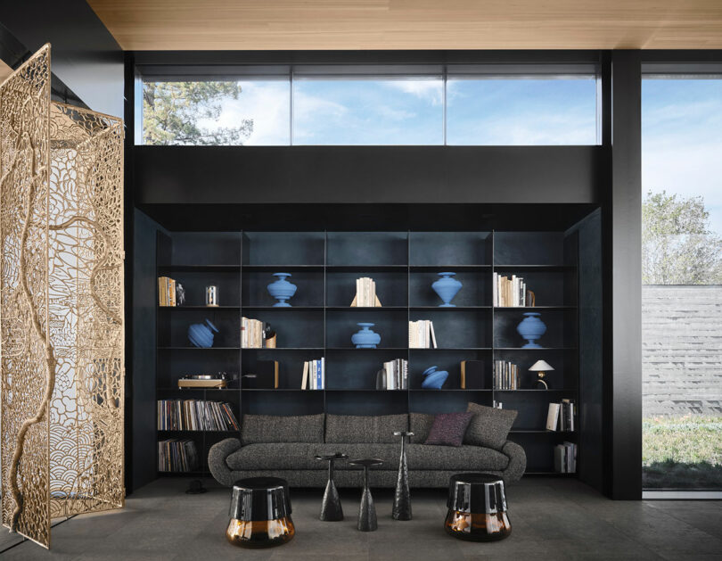
Inside, the formal wing is punctuated by reflecting pools and framed with black steel columns. A pair of 13-foot pivoting glass doors anchor the space, allowing light to flow freely. Custom elements like a botanical bronze screen by artist David Wiseman add further layers of texture and artistry. As Nicole Hollis describes, “A screen by David Wiseman was a custom commission with the artist, and one of the most distinctive choices we made.”
In contrast to the formal living areas, the family zones are designed to feel casual yet luxurious. The kitchen, centered around a 28-foot-long Titiano marble island, opens onto a terrace, extending into the outdoors with dedicated spaces for cooking and dining under the shelter of the primary suite’s cantilevered volume. The outdoor kitchen, pool, and sports facilities encourage an active lifestyle, a design decision Kundig highlights: “The outdoor kitchen literally extends the energy from the main kitchen inside out into the landscape. The pool creates a link between the low-key activity of the house and the more intense recreational activity of the sauna, outdoor gym, and sport court beyond.”
A downstairs powder room houses a sculptural black marble sink surrounded by black wood walls embedded with veins of bronze inlay.
The home’s upper level is equally considered, featuring a serene primary suite that includes a marble bathtub, placed to create a peaceful connection with the surrounding tree canopy. A separate children’s wing adds functionality, providing privacy and play spaces, while at the basement level, a gym and recreation room open into the landscaped lightwell, ensuring natural light flows through even the most secluded parts of the home.
The interiors, masterminded by Nicole Hollis, create a serene and inviting atmosphere, contrasting soft furnishings with the bold architectural lines of the house. “Working with the architectural palette, we selected materials and finishes to contrast against the lush exterior landscape, creating a calming environment,” Hollis explains. The careful interplay between the rigorous architecture and playful interior details softens the space, making it both livable and refined.
For more information on Olson Kundig, visit olsonkundig.com, and for more information on NICOLEHOLLIS, visit nicolehollis.com.
Photography by Douglas Friedman.

On parliamentarians talented, vainglorious, entertaining and anarchic
Our Britain columnist considers the best and the worst of MPs in a lively week in the House of Commons and beyond
Source link

Black Movie Hall of Fame in Kansas City in the Boone Theater Redevelopment in Historic 18th & Vine Jazz District! | WATCH – eurweb.com
Black Movie Hall of Fame in Kansas City in the Boone Theater Redevelopment in Historic 18th & Vine Jazz District! | WATCH eurweb.com
Source link

Will Rising Markets Drive the Next Era of Music Industry Growth?
Goldman Sachs’ “Music in the Air” report has forecasted over $163 billion worth of industry gross revenue for 2030, in part because of anticipated streaming growth throughout emerging markets. But is the prediction, covering recorded, publishing, and live alike, a bit too bullish?
In its newest weekly report, DMN Pro dove into the interesting (and involved) subject across 10 detail-oriented pages, covering all manner of pertinent data and seldom-discussed angles in the process. And while there are several especially valuable takeaways as a result, the streaming-specific findings are particularly noteworthy.
That’s partially due to Music in the Air’s aggressive vision for how exactly emerging markets will factor into the music landscape. As many already know – and as a growing pile of data is driving home – subscriber growth is slowing in developed industries from the States to South Korea, where Spotify is embracing ad-supported listening.
Among other things, the plateau means there’s a greater focus on the monetization potential of quick-rising and largely streaming-driven emerging markets. “Emerging markets will make up 70% of new streaming music subscribers by 2030,” maintained Goldman, attributing a slightly reduced compound annual streaming growth rate, 10% through 2030, to elements including “the shift to subscription revenue from emerging markets.”
By the numbers, that refers to $49.7 billion in paid streaming gross revenue for 2030, nearly double 2023’s $26.4 billion, and a cool 647 million paid subscribers in emerging markets (up from 300 million in 2023), per Music in the Air.
(Concert fans, who already aren’t hesitating to voice ticket-price complaints, will be coughing up even more should Music in the Air’s 2030 live entertainment net revenue forecast, $51.7 billion against $33.1 billion in 2023, prove accurate.)
But is a material medium-term monetization boom really in the cards for these emerging/developing markets? As laid out by DMN Pro, there are too many moving parts (and in an industry where each recent year has delivered sweeping changes on multiple fronts) to reach a definitive conclusion at present.
However, that doesn’t leave us without evidence of streaming’s historical monetization difficulties in emerging markets – adoption isn’t the exclusive problem, as India is still proving hard to monetize despite ranking second to the U.S. in total on-demand streams – and more recent trends.
Attached to individual regions and countries as opposed to the overly broad “developing markets” categorization itself, the trends are exceedingly important when it comes to gauging the industry’s trajectory.
Just at the top level, MENA was for a time the fastest-growing recorded music market of any region, but posted a comparatively modest 14.4% expansion in 2023, according to the IFPI. As streaming accounts for nearly all the revenue at hand, the percentage is indicative of on-demand listening changes, which, in turn, can paint a fuller picture when considered alongside the performance breakdowns of MENA streaming platform Anghami.
The same is true of China’s rapidly expanding music market at the intersection of overall industry results and subscriber trends at Tencent Music. The weekly report covers a variety of other pertinent areas as well, with an emphasis on providing a more comprehensive look at streaming’s path forward in the coming six years.
The House That Alvin Ailey Built
In 1960, the twenty-nine-year-old Alvin Ailey premièred his landmark work, “Revelations,” with the Alvin Ailey American Dance Theatre, the company he’d founded to showcase Black culture through dance. This marked the end of his apprenticeship as a young choreographer who’d grown up revering Katherine Dunham, Lester Horton, Martha Graham, and Jack Cole—American masters with an international perspective. It also launched him into critical purgatory.
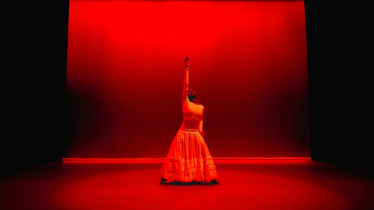
From the start, the thirty-six-minute piece, which depicts Black resilience and Christian faith, and is set to various spirituals, was a hit with audiences, both because of Ailey’s preternatural talent for constructing graphic stage pictures and because it took us to church without our having to go to church. You do not need to have been raised in the South, as Ailey was, or to have attended Baptist services, as he did with his mother, in order to understand what he is doing here, particularly in the final section of the piece, set to the triumphant “Wade in the Water.” The dancers, clad in light colors, step high, their backs straight and heads held high, as they walk across baptismal waters toward their own glory. (Stretches of fluttering fabric simulate the water, an effect that Ailey, a magpie by nature, no doubt borrowed from Jerome Robbins, who did something similar to create a river in “The King and I,” in 1951.) But what you are watching is not just a parade of “vertical saints,” as James Baldwin described his churchgoing brethren, but the work of a choreographer who aims to show us how the metaphysical moves.
In “Revelations,” Ailey turns away from Martha Graham’s anxious world of men and women and myth, from George Balanchine’s plotless ballets, and from Merce Cunningham’s brilliant abstract explorations of the body. Here and in his subsequent work, Ailey tells a different story, one in which the music, the Black dancers’ inner lives, and the choreographer’s memories are the narrative. This shift was especially potent—vital—at a time when the Civil Rights Act was still four years away and activists and protesters were being beaten and burned to death. Without pandering to white tastes or shutting white people out, “Revelations” is resolute in its insistence on portraying Black life and community. The only stage performance from that time that is remotely analogous to “Revelations” is Lorraine Hansberry’s play “A Raisin in the Sun” (1959)—the story of a Black family that doesn’t give up, a story for all families.
After “Revelations,” Ailey continued working for almost three decades—until his death, in 1989—choreographing more than seventy dances. You can see some of them live or in archival footage or photographs, and in dialogue with art that Adrienne Edwards, the protean senior curator and director of curatorial programs at the Whitney Museum of American Art, has gathered, in “Edges of Ailey,” the largest and most comprehensive examination of Ailey’s life, work, influences, and inspirations ever assembled. On the museum’s eighteen-thousand-square-foot fifth floor are works by eighty-two artists, including Lynette Yiadom-Boakye, Lorna Simpson, Jean-Michel Basquiat, Romare Bearden, and Alma Thomas, which illustrate and intersect with Ailey’s themes. There are videos of historic performances, and live stagings by the Alvin Ailey American Dance Theatre and Ailey II in the third-floor theatre. It took Edwards six and a half years to put the show together, but, as she told me this summer, it was a lifetime in the making.
Every curator is a storyteller. And the story that Edwards aims to tell in “Edges of Ailey” is that of Ailey’s many permutations and trajectories—his desire to keep moving forward as a dancer, a choreographer, a teacher, a writer. In the process, she reveals him to have been more culturally important than he is generally given credit for being. Edwards relied greatly on Ailey’s voluminous notebooks and diaries to chart his story, which could not be recounted in a linear way. “What I could do,” she told me, “was relate to things that I found to be illuminating about him, trying to get into a headspace of what it would be like to be a gay man in the nineteen-forties and nineteen-fifties, especially during this moment in his life where you’re founding this thing and coming of age.” Edwards sees Ailey’s literary, theatrical, and intellectual loves as a form of company. In his notebooks, we see him planning and imagining possible projects: a ballet inspired by the life and work of Hart Crane, say, or an exploration of the genius of Federico García Lorca, or of Tennessee Williams—all queer artists who don’t directly appear in Ailey’s dances but who formed a kind of brotherhood in his mind. A lifelong autodidact, he had a deep admiration for writers who were able to speak of their queerness, at least through metaphor. The ultimate metaphor for Ailey was the body, and his work was the language with which to articulate it.
In Ailey’s career, “Revelations” was both a blessing and a curse: a blessing because it kept audiences coming back, and a curse because his subsequent attempts to push against the perimeters of dance—or, more specifically, Black dance—were often measured against that masterpiece and found wanting. Arlene Croce, in her review, in this magazine, of Ailey’s winter 1974 season at City Center—which included “Revelations” and “Masekela Langage” (1969), a work set to the music of the South African composer Hugh Masekela which addresses apartheid—expresses her frustration with Ailey, with his tendency, as she writes, to be “remarkably consistent in trying to capitalize on ‘Revelations’ as if it were a formula success.” She goes on:
Joan Acocella, also writing here, nearly forty years later, observed:
In both reviews, it’s the “they” that concerns me; there’s a whole lot of othering going on, like when white people ask why Black people talk to the screen so much during a movie. There’s also the assumption that a work this popular must be easy. Judith Jamison, Ailey’s great star, made this mistake, too. When she first saw the company rehearsing “Revelations,” in 1963, she said, “Oh, I can do that!” Later, as she writes in her autobiography, “Dancing Spirit,” she changed her tune: “Guess what? You try it sometime. The dancers made the movement look easy. It’s not. It takes unbelievable coordination. It takes passion, commitment, dedication, and love to know that every step you do should be infused with 100 percent of yourself.”
The dance world has always been a segregated place, divided as much by class as by European cultural history. Ailey was an uneven choreographer, for sure, but what he wanted to promote with his company was the idea that Black audiences—general Black audiences, like the folks Acocella probably saw applauding “Revelations”—should connect not only with their “ ’buked” and “scorned” selves onstage but with the feeling that performance can be a kind of balm, an embrace.
“Revelations” grew in part out of memories—of the people who made up Ailey’s community, and thus of Ailey himself. He was born in 1931. His birthplace: a little Texas town called Rogers, between Austin and Waco. This is the territory you’ll find in a Katherine Anne Porter story—“He” (1927), say, or “Noon Wine” (1937)—a world that consists of hard earth and mean poverty, a world where Jim Crow is a defining factor. And so is Jesus. Ailey’s parents, Alvin, Sr., and the beautiful and theatrical Lula, met in church and married when Lula was fourteen. Four years later, their only child was born, but the marriage wasn’t working. When Alvin was three months old, his father took off. Then he returned. He was feckless. “He just didn’t have the education to take care of a family,” Lula says in Jennifer Dunning’s rich biography “Alvin Ailey: A Life in Dance” (1996). When Lula expressed her discontent to her father, he told her to stay married; nevertheless, Lula used her sharecropper’s wages to buy train tickets that got her and her son about a hundred and fifty miles away, to Wharton, where Lula picked cotton for a time, accompanied, on occasion, by Alvin. These were years of closeness, of Lula sharing stories from books that she bought on the cheap, and Alvin showing her a house that he dreamed of living in. There was also violence. As Ailey recounts in his autobiography, “Revelations,” which was published posthumously, in 1995:
Violence can beget violence. The rage that was burned into Lula’s skin—the rage of poverty and abuse—was sometimes turned on Alvin. He recalls in his book that when Lula drank she’d beat him. Alvin’s tears when that happened were evidence not only of physical hurt but of longing: a longing to express how it feels to be wounded, to be loveless. Lula did love him, though, and it showed in all the menial jobs and the small and big humiliations that she endured to support him.
In 1936, she saw a newspaper ad for a job preparing meals for a highway crew eighty miles away, in Navasota. While the five-year-old Alvin stayed with a relative in Wharton, she secured the job, and also found romance with Amos Alexander, a churchgoing Black businessman who was well respected by both Black and white townspeople. Eventually, Lula and Alvin went to live in Alexander’s house.
When Ailey writes, in his autobiography, about his gratitude for the stability of that home and his love for Alexander, who became like a father to him, he seems to rest in a kind of languid joy—the same emotion that one sees and feels at times when watching “Revelations,” which is presented partly from a child’s perspective, particularly in the last section, set on the Sabbath. A big Texas sun shines down on a congregation. Church ladies, sitting on stools in their Sunday best, wave their fans and nod in acknowledgment. These “correct” ladies are joined by their Christian brothers, gentlemen in smart vests, who are a willing, proud audience to the women as they get the spirit and cast off the trials and tribulations of the week. In “Revelations,” Ailey glorifies not only the female body, which most choreographers do, but also the male body, and, more specifically, the Black male dancer, who moves differently onstage than, say, a dancer like Baryshnikov (an Ailey admirer, who appeared in his 1976 piece “Pas de Duke” with Judith Jamison). You can feel that the spotlight is often on the men in Ailey’s work, and his early queer experiences clearly play a part in his artistic story.
In his book, Ailey talks about a twelve-year-old named Chauncey, his best friend when he was eight, and how, one summer afternoon, he and Chauncey were playing by a water tank behind Alexander’s house. It “must have been twenty feet deep,” Ailey writes, “and very slick at the edges.”
Are Shoreditch skyscrapers a London tower too far, even for Boris Johnson? | Architecture
For the first time in Boris Johnson’s ignominious history of calling in planning applications for steroidal slabs of luxury flats, and readily giving them the BoJo rubber stamp, comes a scheme that has proved too much even for the London mayor’s own advisers to stomach.
Their 131-page planning report (pdf) on proposals for the Bishopsgate Goodsyard site concludes that erecting 12 buildings of up to 46 storeys, forming a gargantuan cliff face on the edge of a conservation area, “would result in unacceptable and avoidable significant negative impacts”. Full marks for observation.
The mayor will decide the fate of the scheme next week, in a one-man planning committee reminiscent of an imperial court. Of the 14 controversial applications he has presided over during his reign, he has never gone against the advice of his planning team. Although they have always recommended that permission be granted, until now.
The project has been one of the most fiercely opposed developments in recent history, provoking a petition of 11,000 signatures and 500 letters of opposition, along with 150 local businesses, local MPs and the local planning authorities of Hackney and Tower Hamlets forming a united front against it. In an unprecedented campaign, Hackney council placed advertising at bus stops warning of “a dark future for Shoreditch” and detailing the development’s effects as the “Destruction of local creative and tech community”, “Shadow cast across homes and businesses” and “Unaffordable £1m+ flats not the homes we need.”
It was an unexpectedly ferocious response from the two boroughs, given they had both happily waved through several other towers in the immediate vicinity that could have been accused of these evils.
Principal Place across the road to the west in Shoreditch is a Norman Foster scheme for an office building (which will house Amazon’s new HQ) and a 50-storey golden apartment tower, described by developers as “a new global icon”, where flats halfway up the building are on the market for £3m. Just 13% of units will be classed as “affordable” (ie, up to 80% of market rent) – the borough’s target is 50%.
One block to the north, hoardings surround the site of The Stage, a 40-storey tower of “luxurious apartments with a Shakespearean twist”, the twist being it is on the site of of one of London’s earliest theatres, where Romeo and Juliet was probably first performed. “Sorry,” says the hoarding, apologising not for its ungainly heft, but because all the flats are now sold, bought off-plan long ago by investors. Hackney gladly waived the requirement for any affordable housing in the scheme because of the great burden on the developer of preserving the archaeology, allowing 40 “affordable” homes to be built off-site instead.
Across the road, where Chariots gay sauna and a Majestic wine warehouse still cling on, will soon arrive the lumpy 30-storey tower of the Highgate Hotel, designed by the global corporate firm Gensler in what they say “evokes the raw factory-style of the former industrial Shoreditch”. Did someone forget to tell them factories don’t usually take the form of big glass towers?
Then a little further down the street, right next door to the Goodsyard site, already looms the graceless bulk of the optimistically named Avant Garde tower, the tallest of any of the completed Shoreditch towers so far, but a mere sapling at 25 storeys. The work of Stock Woolstencroft, east London’s go-to architects for fast-buck developers, its own marketing material boasts that it will “dominate the skyline”. Shortlisted for the Carbuncle Cup, its gaudy chequerboard of cheap green glass and metallic beige panels will soon be drowned out by neighbours with much bigger ambitions.

It’s not hard to see why Hammerson and the Ballymore Group, the big-gun developers behind the Goodsyard, are a bit peeved. They’ve been trying to nurture their own £800m thicket of luxury towers since acquiring the site from Network Rail in 2002, and now everyone else has beaten them to it – using the Bishopsgate plans to justify their own aspirational stumps. Hackney’s planning guidance, published in 2009 (pdf), says the Goodsyard is a site for “a tall building opportunity area with scope for a prominent building” and suggests 2,000 homes could be built there, indicating a density a good deal higher than the 1,356 units being proposed.
A closer look at the scheme reveals an equation that simply doesn’t stack up; an attempt to throw a slice of Manhattan at a site incapable of supporting it. Most of the towers are to be built on top of the giant concrete box that houses Shoreditch High Street overground station, meaning they start from a position that’s already 26 metres in the air. The rest of the site is taken up with the mainline railway from Liverpool Street, an eight-track reserve for Network Rail, the protected Victorian Braithwaite viaduct, the Central line and BT Tunnel running underground, as well as strategic views that criss-cross the site, limiting the location of tall buildings.
It’s a series of constraints that made the developers think they could get away with providing zero affordable housing, later offering 10% as a gesture of “goodwill”. The GLA planners are now insisting on 25% affordable units, plus a payment of £21m for more off-site homes. If the mayor refuses the scheme, they will no doubt be back with buildings of a lower height but increased bulk, a different kind of stubby wall to blight Shoreditch.
A more welcome fate would be to take down the hoardings and open up the crumbling viaduct as east London’s own feral version of New York’s High Line; a ruined memorial to the developers who proposed too much – even for Boris.
Points of Departure
Korean art has a place of honor in any museum’s Asian wing, but it may still struggle to free itself from the intoxicating presence of China and Japan. What can match their legacy in ceramics and ink—or in portraiture and landscape?
What can match their art’s restless hands and sensation of contemplation and rest? Would it help to include recent art, as a point of departure into the past? The Met does just that in its Korean gallery, as “Lineages,” through October 20. The result, though, says more about the present than its ancestry. It also confirms a disturbing trend in museums today.  I also work this together with a recent report on Korean art at the Guggenheim as a longer review and my latest upload.
More, and more, museums of art history consider themselves homes to modern and contemporary art as well—and it can cost them, as the Met learned in leasing the Met Breuer. One can see the appeal. Collectors must like a confirmation of their tastes, and that can translate into donations and gifts. The public may like a change from that boring old stuff others call art, and that, a museum hopes, can translate into attendance. Still, it takes money, too, and it can positively detract from older art. The Met’s modest Korean gallery has room for just thirty-two works, and now half are contemporary.
Who knew that Korean and Korean American art so much as had a deep past? Such luminaries as Lee Ufan and Byron Kim have a more obvious debt to Minimalism. (Hmm, maybe artists do not have to be “original” after all in order to stand out, now or long ago. They need only be aware of their world.) The Guggenheim situates Korea of the 1970s in a drive toward youth and experiment. At the Met, Nam June Paik proclaims that Life Has No Rewind Button, and a pioneer of video art should know.
Yet they do have a past, more than you ever knew. Ufan’s abstraction appears right after Bamboo in the Wind by Yi Jeong from more than seven hundred years ago and Blood Bamboo by Yang Gi-hun in 1906. Their vertically descending stains become his descending blues. It is From Line at that, surely a call-out to those who have worked in ink. And then come ink and gouache on paper strips by Kwon Young-woo in 1984 and a wild web of ink lines by Suh Se Ok in 1988.
Kim, in turn, has two monochrome panels in deep green, as abstract as one can get. Yet its glazes echo the materials that convert white porcelain into the paler green of celadon. Older Korean art perfected both. Their polish contrasts with the endless invention of Japanese ceramics, on view out in a corridor overlooking the Met’s great hall. I have my doubts about Kim, but other contemporaries have been eyeing the serenity and symmetry of older “moon jars” for sure. Seung-taek Lee makes his own in 1979, with the illusion of a bit of rope on top to tie it up, while Kim Whanki paints one as far back as 1954, in yellow on a red pedestal against soft green.
 Of course, a jar may be the subject of still-life or a thing in itself, and the Met dedicates the gallery’s four walls to line, persons, places, and things. (Well, that should cover it.) It sounds innocuous enough, although line can become landscape, and landscape can take one to freely imagined places. Park Soo-keun in 1962 lingers over women beneath a tree, in textured oil, at once people and places. The most prominent person, a woman scientist from Lee Yootae in 1944, owes more to mid-century realism and a growing appreciation for professional women than to tradition. And sure, jars become things, at the center of the room, with two by Lee Bul in 2000 as the foot and pelvis of a cyborg.
One can still value a golden age that lasted nearly a millennium, until Europe sailed right in. Indeed, one had better. Where Chinese art once admired those who gave up power to stand outside of place and time, Kim Hong-joo in 1993 creates a layered, divided landscape, which the Met sees as commentary on a divided Korean peninsula. I prefer to think that Hong-joo got it right, but the Met still gets it wrong. Does my resistance to the contemporary make more sense in Asian art, which so often provided a greater tranquility? I just hate to see the past crowded out and forgotten.
Read more, now in a feature-length article on this site.

The Cuma Project
Stinkfish collabs with Mazatl and Kill Joy in Honduras on the Cuma Project, an independent initiative in several rural communities in the western part of the country that borders El Salvador.
The goal of the project was to visit a variety of communities that have been affected by hydroelectricity. The artists completed a series of interventions on school facades and communal houses.
They worked with COPINH (The Council of Popular and Indigenous Organizations of Honduras), an organization devoted to the defense of the environment, the land, and the local indigenous culture, the Lenca.
Stinkfish on the Cuma Project:
“We met up in Tegucigalpa, the capital of Honduras. From there we took buses to La Esperanza, the Capital for the state of Intibucá and where the headquarters of COPINH are. Once we got settled in La Esperanza, we planned our work route for the following three weeks, so that we could visit certain communities as safely as possible and work on our interventions despite the heated environment, the constant harassment and threats after several confrontations with legitimate and illegitimate representatives of the hydroelectric corporations, and the assassination of Berta Cáceres (co-founder and leader of COPINH).
The following three weeks we had the opportunity to visit the communities of Llano Grande, La Ceibita, Las Delicias, Las Mesitas and Rio Blanco. In their majority communities that can only be accessed by foot, that ironically don't have electricity and limited means of communication.
The images that accompany these words are a brief summary of the experiences that we had in those days on the road, in communities that are committed to a struggle for their land, their rivers and their way of life, that shared with us a plate of food, a swim in the river, a soccer match, their experiences, history, knowledge, problems and victories.
The struggle and work of the likes of Berta Cáceres and organizations like COPINH lives on in Latin America and many other regions of the world.”


@killchoy
@graficamazatl
@stinkfishstink

Calico Wallpaper Makes Gold With Alchemy and Enchantment
Since 2013, Calico Wallpaper has presented the finest, most immersive wall murals on the market. Their new collection is in collaboration with Kindergarten teacher and Early Childhood Educator Janene Ping. Ping, who maintains a prolific natural dyeing practice, aims to highlight the balance and beauty of nature. Teaching at the Hawthorne Valley Waldorf School for thirty years has given her the insight and sensitivity needed to foster a love for the great outdoors in our little ones. This collaboration features two distinct collections, Alchemy and Enchantment.
The Hawthorne Valley Waldorf School is committed to providing children with the tools they need to become aware citizens. During their time, they grow a personal relationship with the natural world, and learn to become an active participant in their local economy. Handcraft and artistry is paramount, essential for humans to truly connect with the earth. Ping, a natural dyer extraordinaire, creates fantastic silk tapestries for The Magical Puppet Tree Theater – which she founded in 1992. Through this joyful medium, she uplifts a collection of fanciful stories often untold.
“The dying process reveals a journey in which the unforeseeable enchantment of color unfolds each time the fibers are lifted from the brewing vessel,” notes Ping. “The revelation of unexpected hues is the most rewarding. It’s been a wonderful opportunity and journey to explore my work on a greater scale. Seeing it come to life has been magical.”
The Alchemy collection illustrates what the beauty of hand-dyeing does so well: transparent ripples of organic colors splash across the silk, which are then translated into these wall murals. The dye is saturated by different fibers at different rates, allowing for a blooming, watercolor effect. Alchemy is available in seven colorways – Vetiver, Woad, Turmeric, Marigold, Acacia, Walnut, and Rosewood.
Enchantment pulls upon the organic lulls and changes in tone that we find constantly in nature. One can almost make out delicate landscapes in the midst of the undulating hues, yielding softly to their neighbors. Enchantment is available in seven colorways as well – Logwood, Allium, Goldenrod, Bark, Neem, Rainbow, and Hawthorn.
“I’m grateful for the hands-on education and experiential learning that The Hawthorne Valley Waldorf School has provided to my children and the other students within the community,” shares Rachel Cope, Creative Director of Calico Wallpaper. “This inspired us to work with Janene to develop Alchemy and Enchantment, offering us an opportunity to give back to the organization that continues to support our children.”
Calico Wallpaper was born out of the notion that art shouldn’t just live in a frame. Balancing background and foreground, texture, color, and finish is a task of endless possibility, ensuring there’s always some new discovery around the corner. Boundless and beautiful, the mesmerizing fullness of a wall mural can add incredible depth and luxury to any space, at any age.

Rachel Cope and Janene Ping Photo: Em McCann Zauder
To learn more about the Alchemy and Enchantment collections, visit calicowallpaper.com. To connect with the Hawthorne Valley Waldorf School, visit their website here.

