The Cuma Project
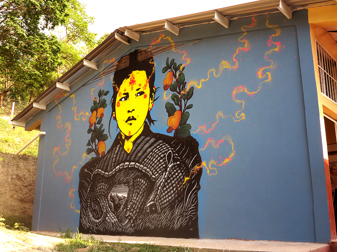
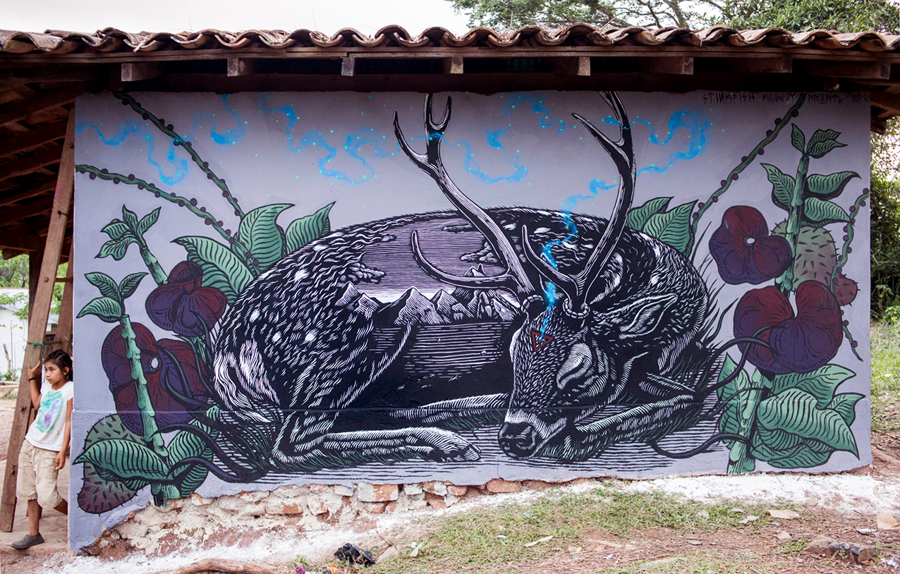
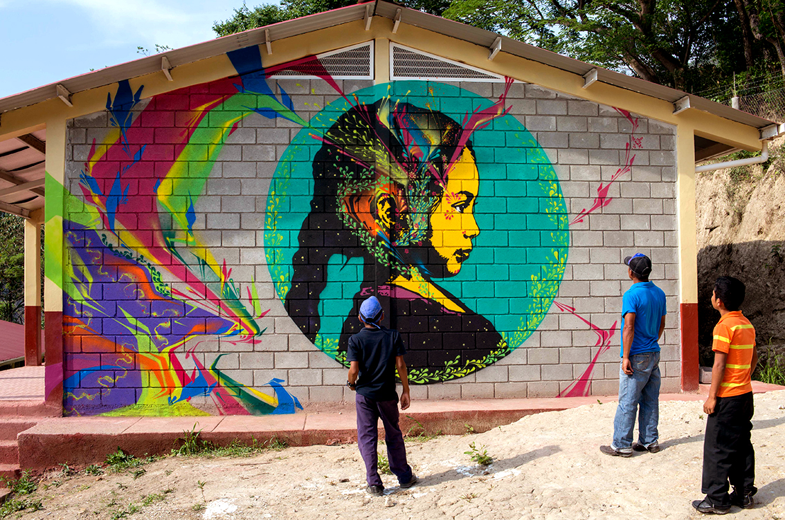
Stinkfish collabs with Mazatl and Kill Joy in Honduras on the Cuma Project, an independent initiative in several rural communities in the western part of the country that borders El Salvador.
The goal of the project was to visit a variety of communities that have been affected by hydroelectricity. The artists completed a series of interventions on school facades and communal houses.
They worked with COPINH (The Council of Popular and Indigenous Organizations of Honduras), an organization devoted to the defense of the environment, the land, and the local indigenous culture, the Lenca.
Stinkfish on the Cuma Project:
“We met up in Tegucigalpa, the capital of Honduras. From there we took buses to La Esperanza, the Capital for the state of Intibucá and where the headquarters of COPINH are. Once we got settled in La Esperanza, we planned our work route for the following three weeks, so that we could visit certain communities as safely as possible and work on our interventions despite the heated environment, the constant harassment and threats after several confrontations with legitimate and illegitimate representatives of the hydroelectric corporations, and the assassination of Berta Cáceres (co-founder and leader of COPINH).
The following three weeks we had the opportunity to visit the communities of Llano Grande, La Ceibita, Las Delicias, Las Mesitas and Rio Blanco. In their majority communities that can only be accessed by foot, that ironically don't have electricity and limited means of communication.
The images that accompany these words are a brief summary of the experiences that we had in those days on the road, in communities that are committed to a struggle for their land, their rivers and their way of life, that shared with us a plate of food, a swim in the river, a soccer match, their experiences, history, knowledge, problems and victories.
The struggle and work of the likes of Berta Cáceres and organizations like COPINH lives on in Latin America and many other regions of the world.”

@killchoy
@graficamazatl
@stinkfishstink
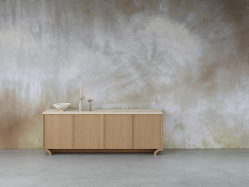
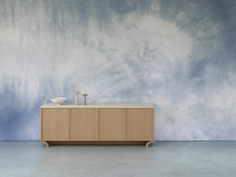
Calico Wallpaper Makes Gold With Alchemy and Enchantment
Since 2013, Calico Wallpaper has presented the finest, most immersive wall murals on the market. Their new collection is in collaboration with Kindergarten teacher and Early Childhood Educator Janene Ping. Ping, who maintains a prolific natural dyeing practice, aims to highlight the balance and beauty of nature. Teaching at the Hawthorne Valley Waldorf School for thirty years has given her the insight and sensitivity needed to foster a love for the great outdoors in our little ones. This collaboration features two distinct collections, Alchemy and Enchantment.
The Hawthorne Valley Waldorf School is committed to providing children with the tools they need to become aware citizens. During their time, they grow a personal relationship with the natural world, and learn to become an active participant in their local economy. Handcraft and artistry is paramount, essential for humans to truly connect with the earth. Ping, a natural dyer extraordinaire, creates fantastic silk tapestries for The Magical Puppet Tree Theater – which she founded in 1992. Through this joyful medium, she uplifts a collection of fanciful stories often untold.
“The dying process reveals a journey in which the unforeseeable enchantment of color unfolds each time the fibers are lifted from the brewing vessel,” notes Ping. “The revelation of unexpected hues is the most rewarding. It’s been a wonderful opportunity and journey to explore my work on a greater scale. Seeing it come to life has been magical.”
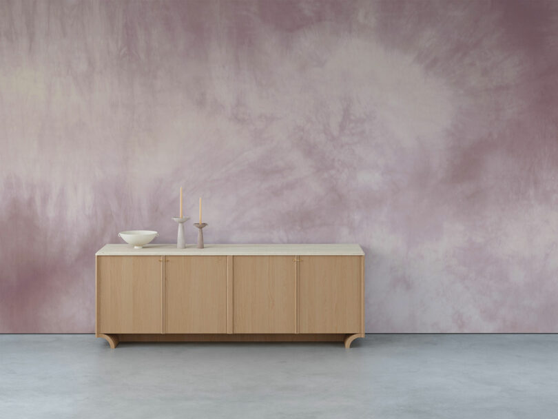
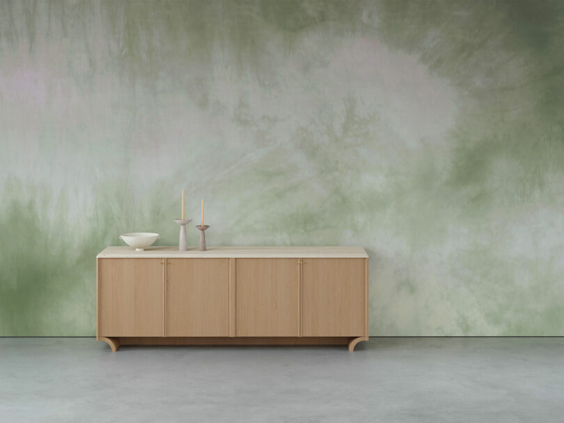
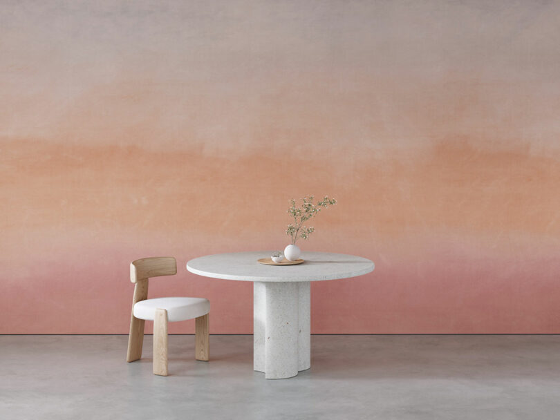
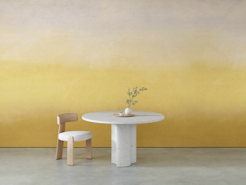
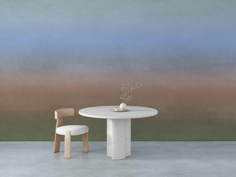
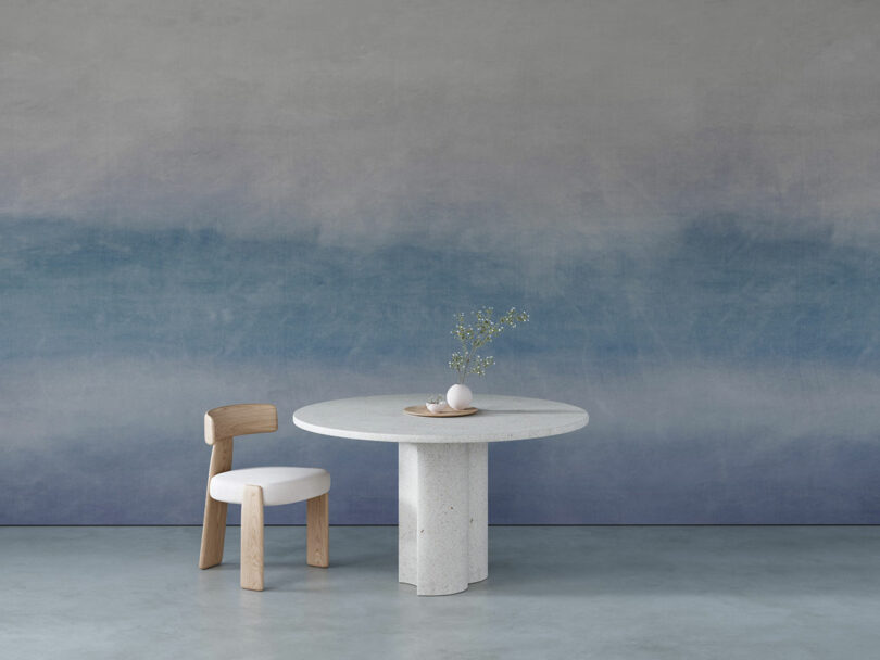
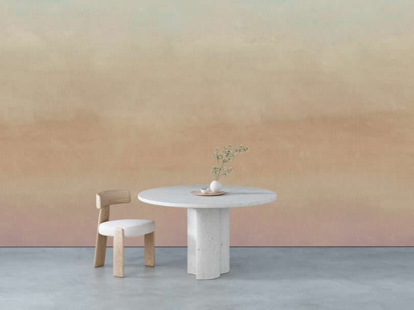
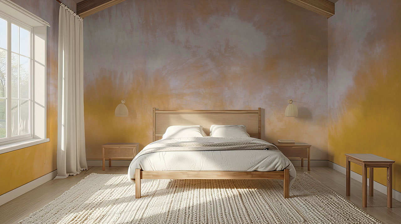
The Alchemy collection illustrates what the beauty of hand-dyeing does so well: transparent ripples of organic colors splash across the silk, which are then translated into these wall murals. The dye is saturated by different fibers at different rates, allowing for a blooming, watercolor effect. Alchemy is available in seven colorways – Vetiver, Woad, Turmeric, Marigold, Acacia, Walnut, and Rosewood.
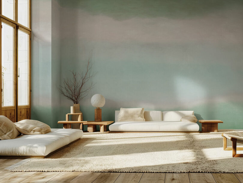
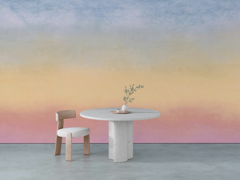
Enchantment pulls upon the organic lulls and changes in tone that we find constantly in nature. One can almost make out delicate landscapes in the midst of the undulating hues, yielding softly to their neighbors. Enchantment is available in seven colorways as well – Logwood, Allium, Goldenrod, Bark, Neem, Rainbow, and Hawthorn.
“I’m grateful for the hands-on education and experiential learning that The Hawthorne Valley Waldorf School has provided to my children and the other students within the community,” shares Rachel Cope, Creative Director of Calico Wallpaper. “This inspired us to work with Janene to develop Alchemy and Enchantment, offering us an opportunity to give back to the organization that continues to support our children.”
Calico Wallpaper was born out of the notion that art shouldn’t just live in a frame. Balancing background and foreground, texture, color, and finish is a task of endless possibility, ensuring there’s always some new discovery around the corner. Boundless and beautiful, the mesmerizing fullness of a wall mural can add incredible depth and luxury to any space, at any age.
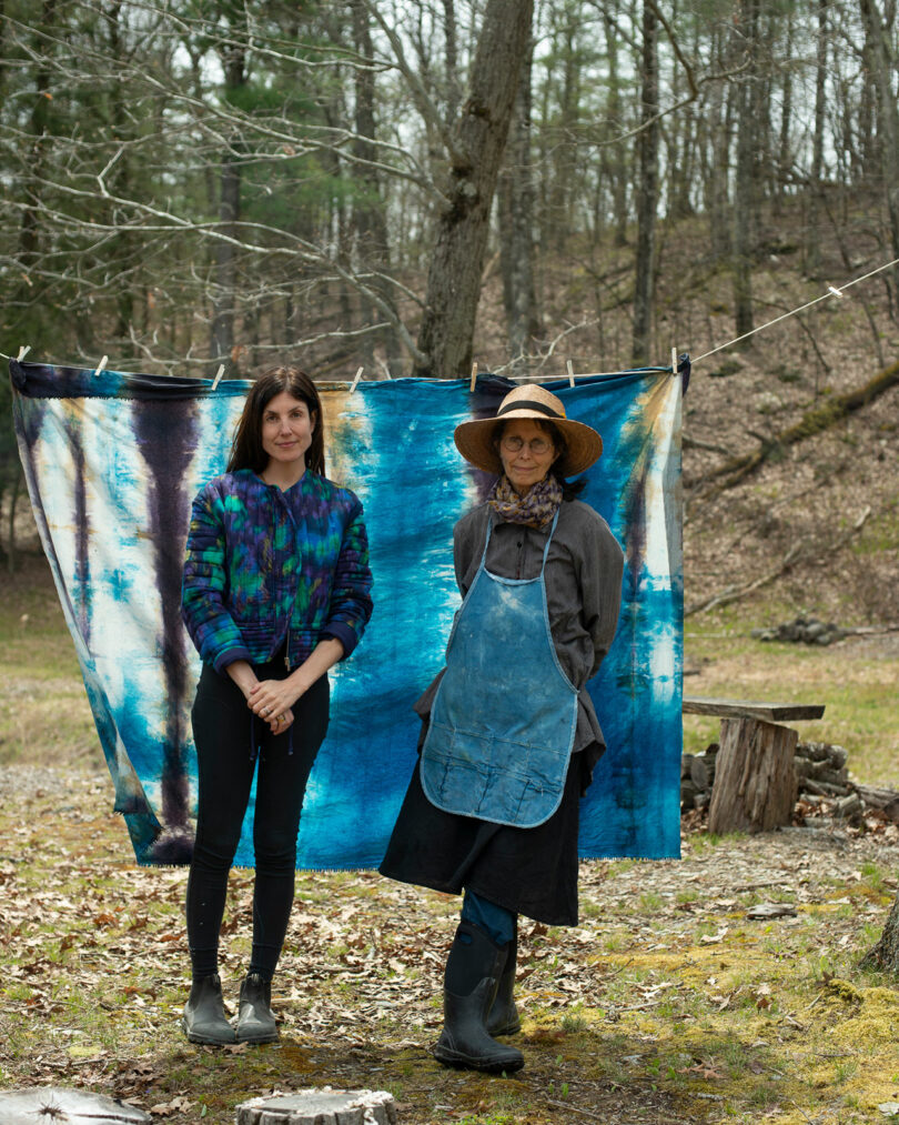
Rachel Cope and Janene Ping Photo: Em McCann Zauder
To learn more about the Alchemy and Enchantment collections, visit calicowallpaper.com. To connect with the Hawthorne Valley Waldorf School, visit their website here.
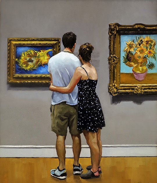
A Painting Today: “Two By Two”
8 x 10″
oil on panel
sold
In 1890, in a letter to his sister, Vincent van Gogh described his joy of painting multiple versions sunflowers. He wrote the paintings were “almost a cry of anguish while symbolizing gratitude in the rustic sunflower.” It brought him comfort and familiarity and raised his spirits, he continued to write.
A couple stands between van Gogh’s Sunflowers and Still Life: Vase with Fourteen Sunflowers exhibited together in the Metropolitan Museum of Art in New York City.
Harrison Ford keeps working for ‘human contact’. Could he be any more beloved? | Harrison Ford
Imagine for a moment that you are Harrison Ford in the year 2024. You are 82 years old, and arguably one of the last living old-school movie stars, held aloft above an army of actors whose names don’t get people to buy tickets. You’re Han Solo. You’re Rick Deckard. You’re Indiana Jones, for crying out loud. How do you navigate through life with a legacy like that?
Some actors at this point would yank up the drawbridge and rest on their laurels. And who could blame them? They’ve earned their money. They’ve achieved immortality. Any more work on top of that would simply undermine all they’ve forged. Say what you like about Gene Hackman, but at least he’s never going to junk his reputation by coming out of retirement to appear in, say, Dirty Grandpa.
But this is not the path that Harrison Ford has chosen. Because right now Harrison Ford is everywhere. Last year he made his fifth Indiana Jones film. This week he’ll reprise his role as a cranky therapist on Apple TV’s Shrinking. He’s just finished filming the second season of the blockbuster western 1923, and next year he’s joining the MCU, pulling double duty as both the president of America and a literal Hulk.
Ford’s relentless work ethic came up during an interview with Vanity Fair recently. “What do you get out of acting nowadays?” he was asked. His response: “Oh man, I get out of it essential human contact.”
There was more to it than that – he went on to say that he enjoys working with talented people – but the crux of it simply seems to be that working gets him out of the house. Sitting and festering is for other people. He’s a doer.
The result of this is that Ford is now doing work that pushes at the limits of his legacy. The most recent Indiana Jones might not have set the box office alight, but it let him tell a story about what happens to heroes when they get older and punch a bunch of Nazis in the face in the digitally de-aged prologue. 1923 saw him test the boundaries of his trademark gruffness over a long-form format. Shrinking is the most charming thing on television at the moment, in part thanks to Ford’s willingness to cut loose. And even if the next Captain America fails to restore the MCU to its former glory, there’s something extremely giddy about the thought of Harrison Ford running around in a mo-cap suit hulking out like he did that time at Comic-Con.
There’s now a looseness to Ford that hasn’t always been there. For a while his reputation was that of a hunched and grumpy recluse who couldn’t quite find his place. He made action films like Firewall and Paranoia that aimed to be throwbacks but ended up drifting dangerously close to straight-to-DVD fare. In interviews he was guarded and brittle, and perhaps a little lost. In retrospect, this hesitance seems to stem from a desire to protect his legacy. Watching him back then was like watching a boxer in the 12th-round, trying to last the course in the vain hope that he’d be able to snatch a win on points.
What a difference to today. The reason why he is working so much at the moment is because he has stopped gripping the reins so tightly. If your motivation to work is to simply be around people, that means you get to do whatever you want. It doesn’t matter if you fail or not, because that isn’t the reason you entered into it.
after newsletter promotion
It’s paying off, too. Especially on Shrinking, which is so warm and endearing that you hope they never stop making it, Ford has never seemed so relaxed. He was always respected, but now he is beloved. And all because of basic human contact. Who knew?

Fog Design + Art appoints first fair director, highlights new galleries and offerings – SF Chronicle Datebook
Fog Design + Art appoints first fair director, highlights new galleries and offerings SF Chronicle Datebook
Source link
Sea rescues and green revolution – southern Italy’s foremost photo festival – in pictures | Art and design

Seattle’s Book-It Theatre Rises Again
This new incarnation of Book-It will not be a producing company. They are not hiring a staff or planning a full season. You cannot buy a subscription. They’re starting with one show, a co-production running Oct. 10-20 at Vashon Repertory Theatre. After that? They’re not sure yet. – Seattle Times
OAE/Fischer review – historically informed Bruckner thrills | Classical music
Anton Bruckner’s symphonies are some of the most self-consciously monumental in the classical canon. It can be hard to imagine – let alone hear – those murmuring openings and vast, brassy climaxes without the precision and power of a modern symphony orchestra. But to mark the composer’s 200th birthday, the period-instrument Orchestra of the Age of Enlightenment continued its unhurried foray into the late-Romantic repertory with Bruckner’s Fifth Symphony.
If “historically informed performance” suggests holier-than-thou small-scale, think again: this one featured eight brass players, with six double-basses as the formidable engine of a hefty string section. The big tunes surged. In the relatively intimate acoustic of the QEH, the breakthrough chorales verged on deafening. There was little information about the instruments themselves – simply “closer to those that would have been used in Bruckner’s day” – but such quibbles fade to meaningless in the face of results this thrilling.
The strings (presumably playing on gut) were mellow and translucent, vibrato used sparingly. Richness of tone – and this was a seriously deluxe, velveteen richness – emerged from exquisite bow control. Woodwind solos were characterful in the extreme: laser-like in focus, the flute almost hollow in its woodiness, double reeds raw and acidic, all precision-sculpted. The brass injected periodic blooms of luminosity but remained deeply connected to the rest of the orchestral tissue, never dominating even in the finale’s deeply carved apotheosis.
On the podium, negotiating the numerous structural challenges of this symphony, was Adam Fischer. Sometimes he leaned back like a man waiting for a bus; sometimes he looked as if he was dancing with a light sabre in a phone box; sometimes he wielded his baton like a meat-cleaver. He switched gears from spacious to frantic more or less instantaneously, driving the orchestra like a custom-built sports car through the twists, halts and repetitive eddies of Bruckner’s score. Every pizzicato phrase had its own shape, every silence-pocked passage a sense of macro-structure. The long, generous melody of the second movement relaxed like a collective exhalation. But Fischer came into his own handling Bruckner’s obsessive repetitions: pushing through circles of fifths and fugal mechanics, constantly in search of the bigger picture.
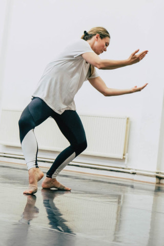
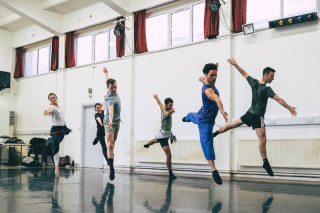
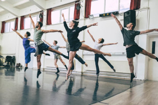
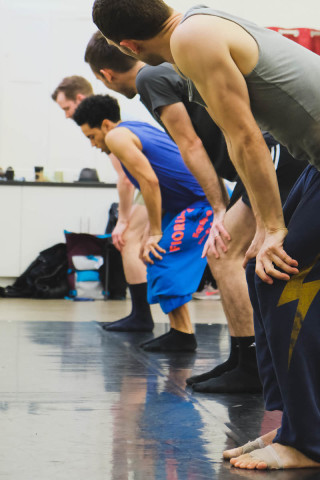
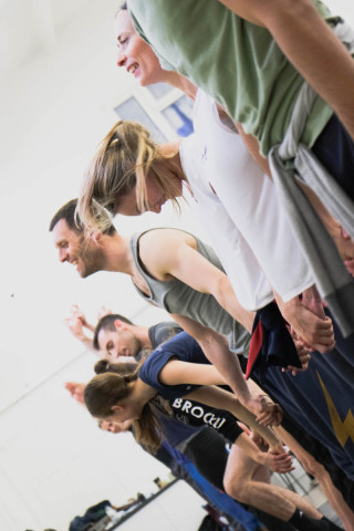
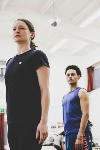
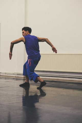
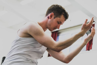
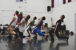
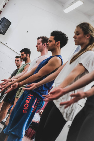
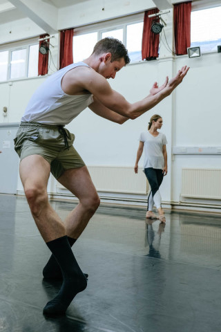
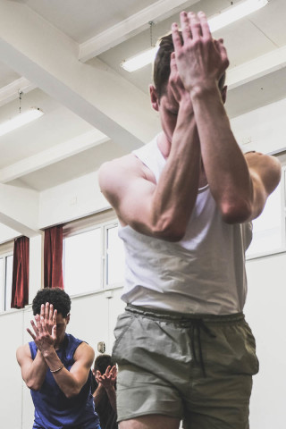
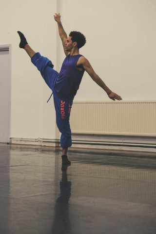
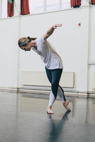
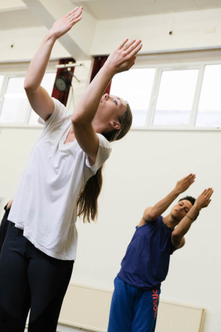
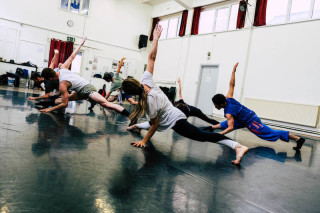
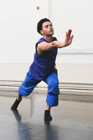
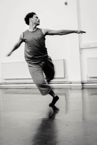
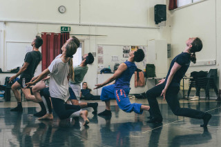
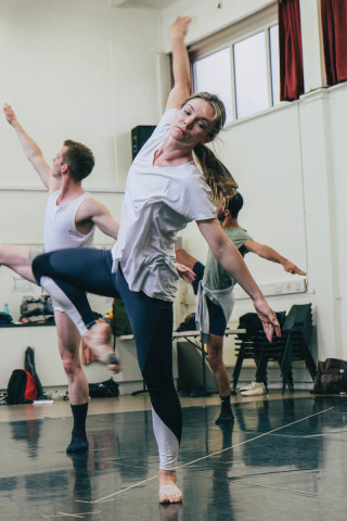
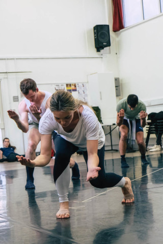
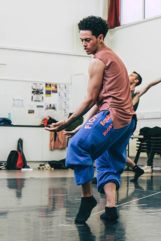
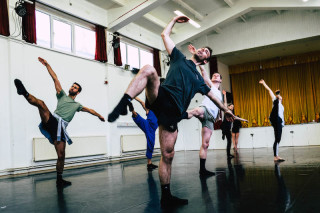
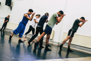
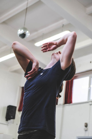
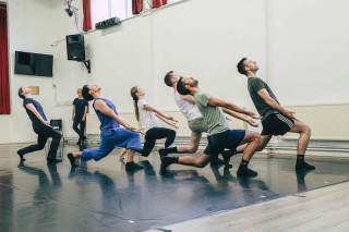
Yorke Dance Project Celebrates its 20th Anniversary (Photo Gallery)
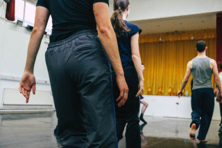
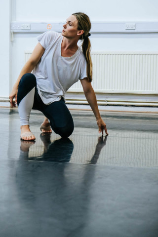
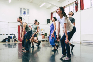
Yorke Dance Project is a contemporary ballet touring company. Under the artistic direction of Yolande Yorke-Edgell, the company has a repertory that includes vintage pieces (Kenneth MacMillan, Robert Cohan) and that also embraces new talent and young female choreographers. Last time we photographed the troupe, the dancers had been rehearsing for a programme at Sadler’s Wells that covered MacMillan’s Sea of Troubles alongside Charlotte Edmond’s Self.
This week, the company is celebrating 20 years of its creation by Yorke-Edgell with a set of performances at the Royal Opera House. Joined by some terrific guest dancers like Jonathan Goddard, Dane Hurst, Romany Pajdak (The Royal Ballet) and Oxana Panchenko (Michael Clark Company), Yorke Dance Project is at the Clore Studio until this Friday 17 May performing works by Yolande herself (Between and Within), Kenneth MacMillan (Playground), Robert Cohan (Communion) and by LA-based choreographer Sophia Stoller (Imprint). We checked in on the ensemble earlier this month:
All photos: © The Ballet Bag.
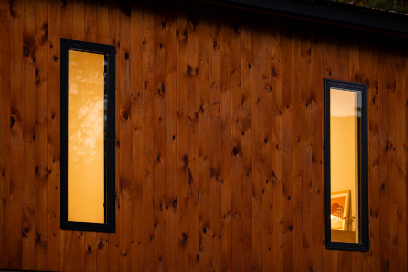
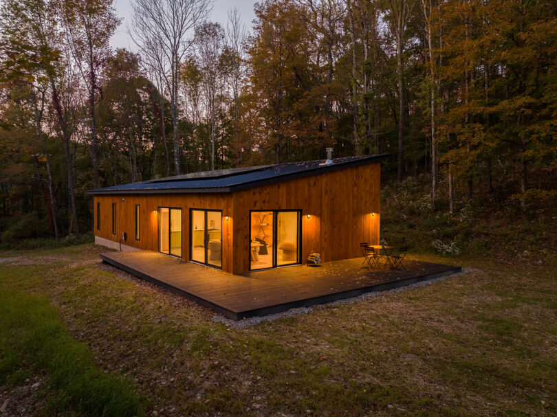
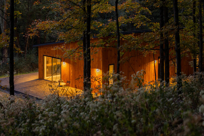
Hillcrest House Offers a Solar-Powered Escape in West Catskills
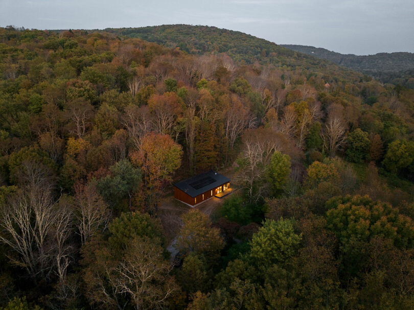
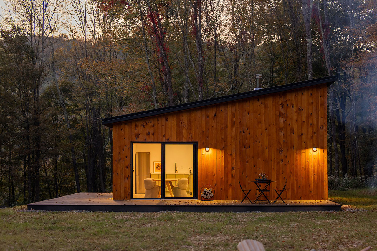
Edifice Upstate is redefining sustainable living in the Western Catskills with its latest architectural venture, Hillcrest House. Specializing in the design and development of eco-conscious, solar-powered homes, Edifice Upstate merges modern design with cutting-edge green technology, offering residents a unique opportunity to live in harmony with nature. The company, led by Marc Thorpe, an award-winning architect, and Claire Pijoulat, co-founder of WantedDesign, aims to provide affordable, self-sufficient housing solutions for those looking to reduce their environmental footprint without sacrificing comfort or style.
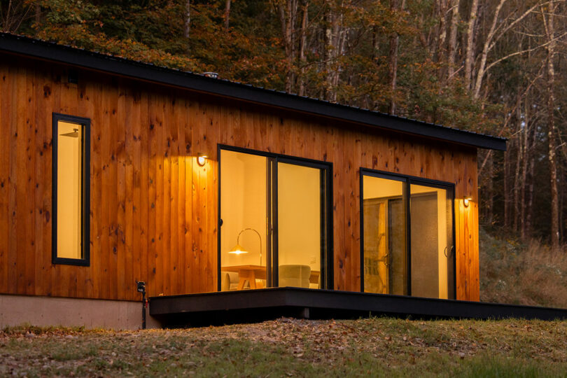
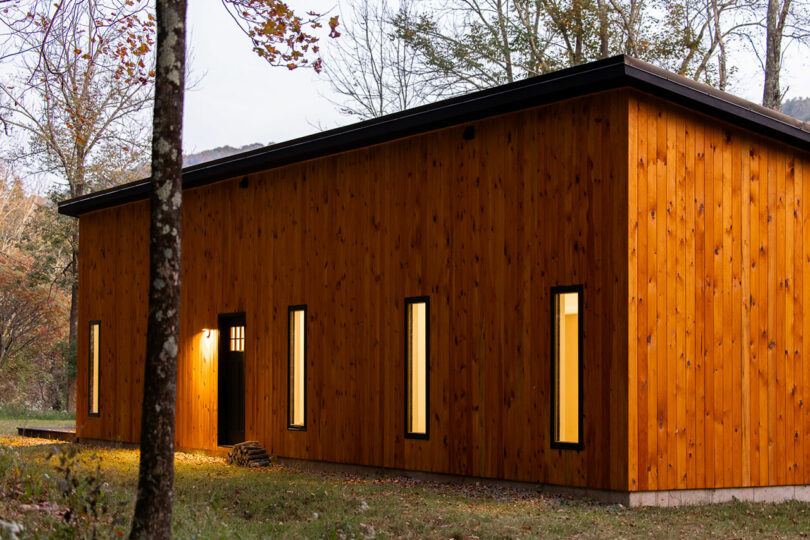
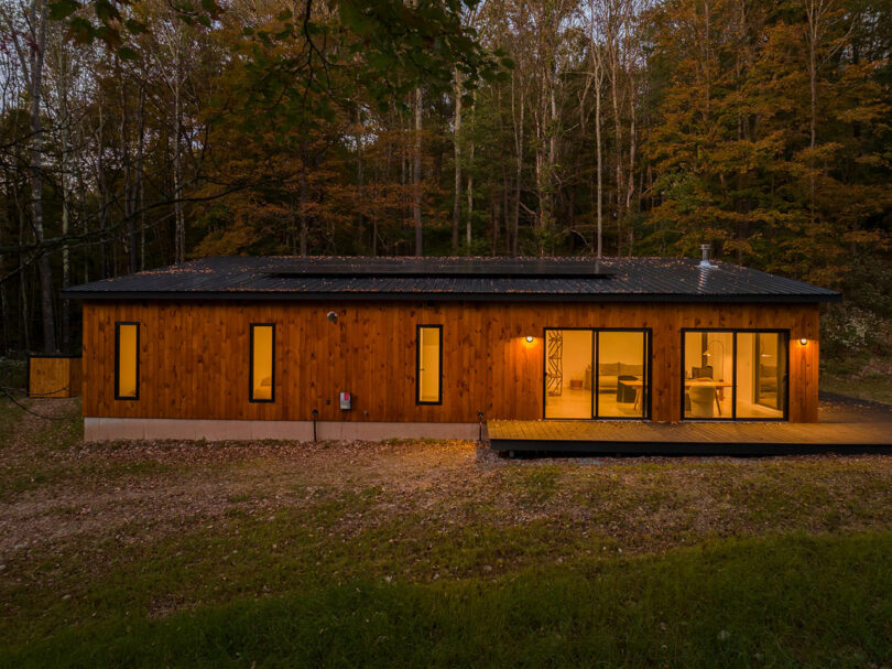
The heart of Edifice Upstate’s vision is the belief in self-reliance and a lifestyle integrated with the environment. This ethos is embodied in Hillcrest House, a solar-powered home perched on a secluded hilltop, surrounded by forest while still being conveniently close to the upstate hamlet of North Branch. Designed with simplicity and balance in mind, the home, which is just two hours northwest of New York City, offers a tranquil escape, with modern conveniences and sustainable features seamlessly woven into its architecture.
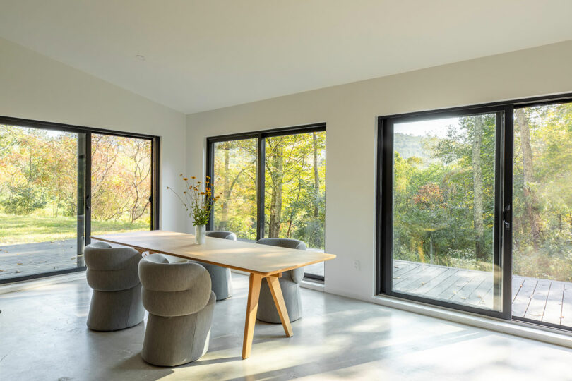
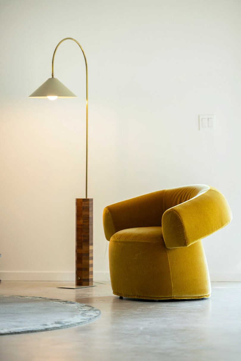
Hillcrest House is powered by an impressive solar array, boasting sixteen panels that ensure the house operates independently of the grid. With a battery storage system that can sustain the home for up to five days, residents can rely entirely on solar energy without needing backup generators. This commitment to sustainability doesn’t stop at power generation – the home’s design incorporates efficient use of space, with features like polished concrete floors, high ceilings, and open-plan living areas that create a feeling of spaciousness within a modest footprint.
The property, which spans five acres, offers more than just a place to live – it provides a gateway to the surrounding natural beauty of the Catskills. From the expansive sundeck, residents can soak in the sweeping views of the forested landscape, or venture further into the wild to discover apple trees and a tranquil creek nearby. The home’s location serves as a perfect launchpad for outdoor activities like hiking, fishing, and biking, while remaining close to local dining, shopping, and cultural attractions.
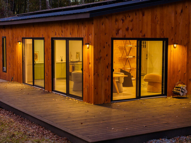
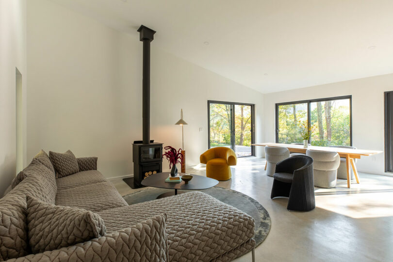
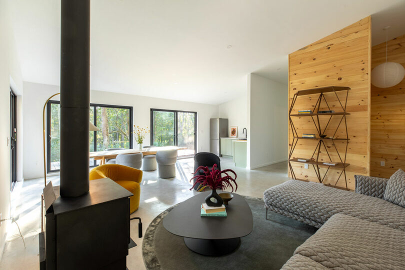
The open interior is centered around a wood stove, which heats the entire home. Framed views of the lush trees can be seen whether sitting on the sofa in front of the fire or around the dining table during a meal. Just outside the series of sliding glass doors, a wraparound wooden deck extends the usable square footage during warmer months.
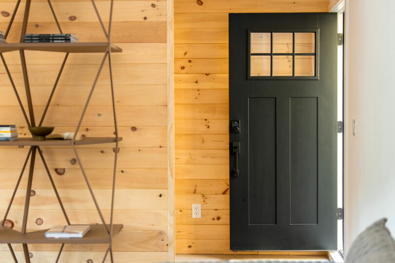
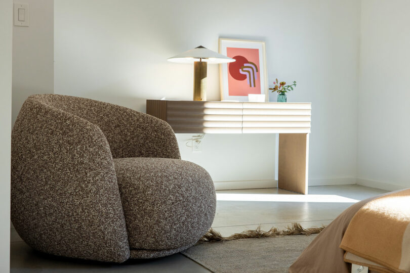
Polished concrete floors unify the interior, while select wood clad walls warm the mostly white space. A short hallway leads to three bedrooms, a full bathroom with walk-in shower, a powder room, and a pantry/storage space. A separate utility room holds the home’s utilities needed to keep it running, like the solar battery bank, water heater, electric panel, and pressure tank.
To see more projects by Marc Thorpe and Edifice Upstate, visit marcthorpedesign.com and edificeupstate.com.
Photography by Steph Mossey.
Writing Process Blog Tour | SelfSelector
Thanks so much to Daniela Cascella for inviting me to take part in the Writing Process Blog Tour. Daniela’s writing, which you can read in her blog as well as in her fantastic book En abîme, is hugely influential for me. I strongly identify with the way she uses language and her interplay of personal memory and sound, of culture and history.
Here are my answers:
What am I working on?
I am currently in a very busy period with quite a substantial amount of commissions for various types of publications and exhibition spaces, which include essays, interviews and reviews. So for the the past three months I have focused on meeting all these deadlines while maintaining the highest possible standard of writing. Whenever I have to produce a lot of writing in a small amount of time I worry about the quality of my texts: repeating myself, running out of fresh ideas and so on. There is always this little paranoia lurking in the back of my head, which adds to the stress of meeting deadlines.
This is why I am very much looking forward to my summer holidays so I can focus on a couple of personal projects that will demand quite a lot of uninterrupted time. The first is a long-form essay which will explore the use of interior and domestic spaces across the fields of film and visual arts to convey psychological states and address issues related with class, domesticity and creative aspirations. The second project could become my first novel (!). I am on the very very early stages of researching and note taking, so it wouldn’t be immediate, but the ideas and the urge are there. I haven’t got the slightest idea of how to write a novel, having written in various short forms up until now, so I still have to develop a methodology of sorts. At this point, however, I just want to sit down and write, and see where that takes me.
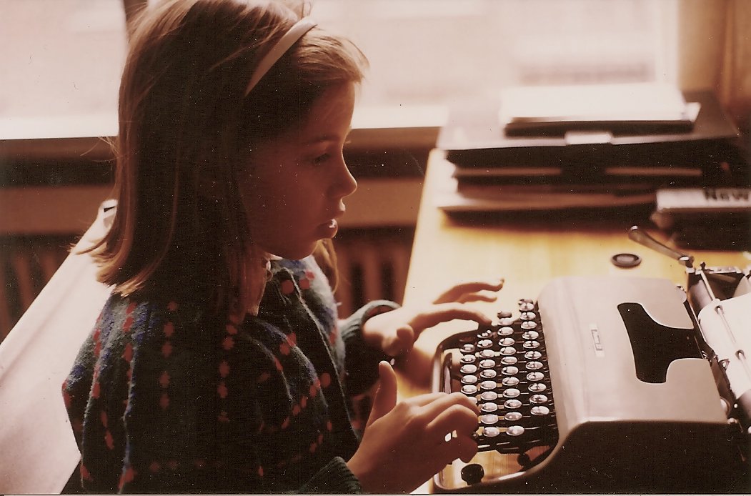
Me, writing god knows what at 8 or 9 years old
How does my work differ from others of its genre?
I have no idea of how my work differs from others of its genre. That is probably not for me to say! I can only say that one of my pet hates involves art writing that sounds very complicated and lofty, but which is just masquerading a total lack of content and personal ideas. I guess that can actually be applied to any sort of writing. I like writing that contains and discusses complex ideas but that manages to do so in an accessible, readable manner. I strive for my writing to be like that.
What do I write what I do?
I have always considered myself a writer, since I was a small child. I started writing short fantastic stories when I was 6 or 7 years (I actually wish I could find those manuscripts, typed with a red Olivetti type writer my brother gave me as a present). When I was a teenager I went through a heavy poetry phase, and all wrote was poetry, which I sort of understood as lyrics to songs I never wrote (yes, I am frustrated musician). I then became a journalist and then I specialised as an art critic, which I have been for a few years now and which is a format that I adore and feel very comfortable with. Art writing is elastic enough to allow and welcome different approaches, even rather experimental, and I can address not just art but also film, critical theory, philosophy and music, which is basically what I want to write about, so I feel very happy about having found this outlet and carved my niche. However, fiction beckons. I have been wanting to write fiction in the form of a novel for pretty much a decade, but it really wasn’t the moment. I feel ready now, I just need the time, which is why I have started applying to writing residencies. It is the first time that I actually have the need for them. What I mean is that I don’t feel tied to any particular type of writing, I feel that the form my writing takes is just an adaptation to my needs and aspirations in different moments. What prevails is an urge to write; to read, to think and to write about art, culture and subjectivities. My ideas for my prospective novel address the same concerns as my art writing. It makes no difference to me.
How does my writing process work?
There are two ways to respond to this question. The first one would be to explain how I write. And the thing is, I don’t have a very strict methodology in place, it varies depending on the particular texts I am facing. After all these years at it, I am very disciplined when it comes to writing and I can manage to just sit down and write on a daily basis, which helps a lot. I am extremely responsive to stimulus though, so I usually benefit from exposing myself to a lot of reading, exhibition seeing and film watching when I have to write. When I am very busy with deadlines and I have to chain my leg to my desk, I barely have time to “nurture” myself in that way and I become quite despondent about it. I need good inputs to produce decent outputs. I believe in intuition, so sometimes I sit to write with absolutely no idea of how am I going to go about it. It just happens. I have never really suffered from “blank page fright”. I am a terrible public speaker, I get nervous when I have to talk or present to an audience, but when I am writing I always feel ok. I might hate what I have written on a given day and delete or re-write most of it, but I am already “in process”, and eventually I will get to something I am pleased with (hopefully). I always, always, write on my computer. I carry a notebook with me at all times and I take lots of notes, and sometimes I will even draft structures for pieces. But once I sit down to write I will barely look at them or use those structures. When I write I inhabit a brand new place, with unpredictable results. When I am working well, I am “riding the wave”. When nothing good comes out, I get mildly depressed or rather cranky, but I keep writing, just in case I can get “to the wave”. I always, always write to music, since I was little. It is very important for me and really determines the mood of what I produce. It usually is experimental, electronic or classical music. It has to be instrumental music, no words. Steve Reich is pretty much my usual soundtrack of choice. Or Eliane Radigue. I play minimal, repetitive music because it gets me to a focused, productive place.
The second way of answering has to do with a new methodology I have developed. When I wrote my text on Eliane Radigue I discovered a way of writing about art, music and historical characters I am interested in which combined fact and fiction. It mixes the genres of essay and fictionalised biography. I am not quite sure how to define it, but I know it’s definitely not new. Some people have pointed an affinity between this particular text and the writing of W.G. Sebald, which both pleases me and humbles me no end. I consider Sebald one of the most gifted, compelling and poignant writers of the 20th century, so I don’t feel worthy of that comparison. In any case, it was incredibly liberating to find a way to write a fiction of sorts while keeping all of my factual and artistic interests in the text. It has given me a much-needed boost of energy and confidence to face my (hopefully imminent) fiction writing.

The role of user-generated content in visual marketing
User-generated content (UGC) has become a popular buzzword in recent years, and for good reason. Not only does it allow companies to create more cost-effective content, but it also adds a layer of authenticity and credibility to their marketing campaigns. In this article, we’ll explore the role of user-generated content in visual marketing, the benefits of incorporating it into your marketing strategy, successful campaign examples, and tips for doing it right.
Benefits of using UGC in visual marketing
UGC can provide many benefits when used in visual marketing. First and foremost, UGC allows for increased authenticity and credibility in your content. Traditional marketing content can come across as self-promotional, which can turn off potential customers. UGC, on the other hand, is created by your customers or followers, which makes it more genuine and trustworthy.
In addition to the authenticity factor, UGC can also drive higher engagement and user involvement. When your customers see that their content is being featured on your social media channels or website, they’re more likely to engage with your brand and create more content. This, in turn, can lead to an increase in followers, comments, and shares.
Finally, UGC can be a cost-effective way to create content. Traditional marketing content can be time-consuming and expensive to produce. UGC, on the other hand, is created by your customers or followers for free. By leveraging UGC, you can save time and money on content creation while still providing valuable content for your followers.
Examples of successful UGC campaigns in visual marketing
Some of the most successful campaigns in visual marketing have leveraged UGC. One example is the “Share a Coke” campaign by Coca-Cola. The company printed popular names on their soda cans and encouraged customers to take photos of themselves with their personalized cans and share them on social media. The campaign went viral, with millions of people sharing photos of their personalized cans, and it led to a significant increase in sales for the company.
Another example is the #ShotOniPhone campaign by Apple. The campaign featured photos and videos shot on iPhones by regular people, and it showcased the quality of the iPhone camera. The campaign was a huge success, and it helped to establish the iPhone as a leading smartphone for photography.
How to incorporate UGC in your visual marketing strategy
If you’re interested in incorporating UGC into your visual marketing strategy, there are a few things you should keep in mind. First, you need to encourage your customers and followers to create and share content. This can be done by creating branded hashtags or hosting contests that encourage user submissions.
It’s also important to make it easy for your customers to create and share content. For example, you can feature a gallery of UGC on your website or social media channels, which can encourage others to submit their content as well.
Finally, it’s important to ensure that your UGC fits in with your overall brand image and values. You should have guidelines in place for the type of content you’re looking for, and you should monitor submissions to ensure that they align with your brand.
Potential challenges and risks of using UGC in visual marketing
While UGC can provide many benefits for your marketing campaigns, there are also potential challenges and risks that you should be aware of. One risk is that UGC can sometimes be negative or off-brand. For example, a customer might submit a photo that is inappropriate or offensive.
To mitigate this risk, you should have clear guidelines in place for the type of content you’re looking for, and you should monitor submissions to ensure that they align with your brand. You can also consider using a platform that allows you to moderate submissions before they’re posted.
Another potential risk is copyright infringement. When customers submit photos or videos, they own the rights to that content.
To avoid any potential legal issues, you should make it clear in your guidelines that users must have the rights to any content they submit. You should also consider using a platform that allows you to verify ownership or obtain permission from the creator before using their content.
Finally, it’s important to ensure that you’re giving proper credit to the creators of any UGC that you use. This can help to build goodwill with your customers and followers and can also help to establish your brand as one that values authenticity and community.
Conclusion
Incorporating user-generated content into your visual marketing strategy can provide many benefits for your brand. By leveraging UGC, you can create more authentic and engaging content, while also saving time and money on content creation.
When done right, UGC can help to establish your brand as one that values community and authenticity, which can lead to increased customer loyalty and sales. To get started with UGC, consider hosting a contest or creating a branded hashtag that encourages your customers to create and share content. With a little creativity and planning, you can use UGC to take your visual marketing to the next level.
