Bodies Come Crashing to the Ground
Drawing human anatomy can be an adventure if you take it to the
limits. Artist and draftsman Leah Yerpe certainly does. Her large- and small-scale
drawings feature figures freefalling, tumbling, and twisting as they swoop
across the page.
 |
||
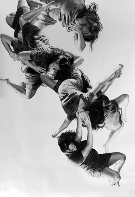
| Pleiades by Leah Yerpe, 72 x 107, charcoal drawing, 2011. |
Though Yerpe's works are much evolved from the anatomy
drawing lessons a beginning artist might encounter, they most likely started
there with some type of anatomy sketches. Without a sure knowledge of how to draw a human body, the artist
wouldn't have been able to render her figure drawings so convincingly in such a variety
of extreme poses.
For instance, in the body drawing Pleiades,
the artist shows a commanding understanding of the diverse movements of the body's
core. The barrel of the torso is shown as it folds over itself; it expands
through the rib cage when the figure arches her back; and her hips tilt to follow
the backward movement of the legs.
Yerpe also has an anatomical sensitivity when rendering what
I like to think of as the exclamation points of the body–the hands and feet. These
may not be the first thing you pay attention to when viewing her drawings, but
they are the culmination of all the bodily tension and power she is showing. If
an arm is bent and cocked back, chances are the hand is drawn in accord with
the movement–fingers clenched into a fist and the tendons in the wrist slightly
bulge.
 |
||
| Cornix by Leah Yerpe, 60 x 113, charcoal drawing, 2011. |
Her drawings of the foot are done in much the same way. If the
leg seems to be relaxed, the foot is in a neutral position with toes slightly
pointed. If the leg is bent or seems to be mid-motion, the toes are drawn up
toward the ankle and the foot itself is arched. In any given situation, the
hands and feet give us more visual information about the physical action of the
bodies being depicted.
Human anatomy for artists can be a gateway for incredibly
dynamic and unprecedented figural works, allowing you to explore the body's
full range of motion. For drawing anatomy, seek anatomy drawing guides that will allow you to see the action of the
body in real time and explore how to artistically express all the movement
and power inherent in our bodies. Enjoy!

SOURCE: Artist Daily – Read entire story here.
75 Years Ago, ‘The Wizard Of Oz’ Helped Cure ‘War Nerves’
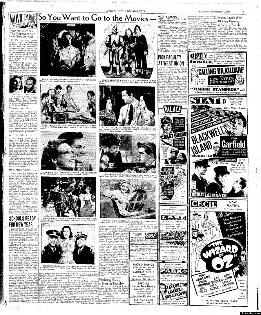
This week in 1939, “The Wizard of Oz” premiered at Grauman’s Chinese Theatre in Los Angeles before its nationwide bow on Aug. 25. The Victor Fleming film was one of Hollywood’s first escapist blockbusters, and treated as such by the media. Courtesy of Ancestry.com comes this Mason City Globe-Gazette article from Sept. 2, 1939, about “The Wizard of Oz,” which calls it a cure for “war nerves.”
“If it’s relaxation you’re seeking from the headlines shrieking of war in Europe and in Asia, we recommend to appease your desire (in spit of avowed failure of other appeasement programs) “The Wizard of Oz,” which opened at the Cecil Saturday and plays there through Thursday,” the piece reads. Check out the full article below, then head down the yellow-brick road or something.

SOURCE: Arts – The Huffington Post – Read entire story here.

‘Sunset’ painting, now at Taft, on new postage stamp’Sunset’…
“Sunset,” a painting by renowned artist Frederic Church currently on display at the Taft Museum of Art, will be featured in a set of postage stamps.
SOURCE: Painting News – Read entire story here.
Critic’s Notebook: German Artists Say They Put White Flags on Brooklyn Bridge
Two Berlin-based artists said they were behind the raising of white flags atop the Brooklyn Bridge last month, and discussed their reasons.![]()
SOURCE: NYT > Arts – Read entire story here.

Matt Murrie: What If Buildings Could Function As Medicine?
If both medications and the environment make physiological and neurological changes in us, could it be possible to design the environment to both engender and habituate attributes and behaviors in ourselves in order to prevent, or even reverse, diseases and disorders?
Read more: Architecture, What If…?, Medicine, Yale School of Medicine, Holistic Medicine, Mayo Clinic, Impact News
SOURCE: Architecture on Huffington Post – Read entire story here.

Her Life with a Little Bit of Fiction


Paintings, drawings, words. All of it. I’m in love with Herikita‘s art. It speaks truths in soft colors and is quite often made-up of angled homes and rooftops, pets and insects, women and men, all of whom are sharing their awkward feelings and I just want more and more of it.
Her bio alone was enough to make me smile. Here’s a small bit of my favorite part, “I work at midnight like Cinderella�s mice, almost always, when everyone is sleeping and something pops up in my mind..”
It’s such a great visual. 


SOURCE: Doodlers Anonymous – Read entire story here.

This week’s top 5 hot theater picks: ‘Full Gallop,’ ‘Wait Until Dark’ and more – Dallas Morning News (blog)
 Houston Chronicle |
This week's top 5 hot theater picks: 'Full Gallop,' 'Wait Until Dark' and more
Dallas Morning News (blog) How hot is Full Gallop at WaterTower Theatre in Addison? The show has already attracted Tony Award winning director Kathleen Marshall to its Monday opening night. The one-woman show starring Diana Sheehan as fashion icon Diana Vreeland is one of … 'Full Gallop' a delectable divertissement |
SOURCE: theater – Google News – Read entire story here.

Met Opera Sets Another Deadline For Contract Talks

Federal mediators announced that the company’s new deadline for agreement is Sunday, August 17, just five weeks before opening night of the new season. Met general director Peter Gelb has been threatening a lockout if the deadline is not met.
SOURCE: ArtsJournal» MUSIC – Read entire story here.

The First Domino? One Of Italy’s Crisis-Ridden Major Opera Houses Goes Dark

Bari’s Teatro Petruzzelli, the country’s fourth-largest opera house, is simply out of money. With both the city council and the regional government having slashed funding, the Petruzzelli has cancelled the two productions it had scheduled for this fall, and no one is sure if or when it will reopen.
SOURCE: ArtsJournal» MUSIC – Read entire story here.
New Release: Rainbow Bridge From The Upstream Side (Color)
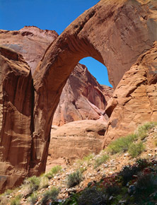
New Release: Rainbow Bridge From The Upstream Side (Color)
“Rainbow Bridge From The Upstream Side, Now Rainbow Bridge National Monument, Utah, (Color) 1965” from the Sierra Club Exhibit Format Series book, “Navajo Wildlands: As Long As The Rivers Shall Run” by Stephen C. Jett and Philip Hyde.

Rainbow Bridge From The Upstream Side, Now Rainbow Bridge National Monument, Utah, (Color) 1965 by Philip Hyde.
The Special Edition Archival Fine Art Digital Prints made by David Leland Hyde and Carr Clifton, a 30-year friend and protege of Philip Hyde, are rare and limited in a unique way. They are limited through pricing. The regular prices only apply to the first 10 prints of each photograph. Each time 10 prints sell of each image, that particular photograph goes up $100 in all sizes. For more specifics on pricing and further information about the unique archival fine art digital prints see the blog post, “About Archival Fine Art Digital Prints.”
Philip Hyde Photography is proud to present an archival fine art digital print of “Rainbow Bridge From The Upstream Side, Now Rainbow Bridge National Monument, Utah, (Color) 1965.” To read more about the making of this vintage photograph go to the blog post, “The Making Of Rainbow Bridge From The Upstream Side.” This photograph was never printed by Philip Hyde himself. Therefore, this release of archival digital prints enables collectors to have this historically important photograph for the first time. When first released in August 2010, this photograph came out as a limited edition. Now that all Philip Hyde authorized archival digital prints are made in limited editions in the two largest sizes, 24X30 and 32X40, this photograph is also available as a limited edition in the 24X30 size only and as a numbered special edition in all other sizes. This photograph is not available as a 32X40 print.
First published on August 9, 2010, which would have been Ardis Hyde’s 85th birthday.
SOURCE: Fine Art Photography Collector’s Resource – Read entire story here.

Win A Lifetime Skillshare Membership To Enhance Your Design Skills
The following post is brought to you by Skillshare. Our partners are hand-picked by the Design Milk team because they represent the best in design.
You may have already heard of Skillshare, the online learning community to master real-world skills. Members have unlimited access to hundreds of online, project-based classes taught by experts in creativity, design, business and technology. From introductory courses to intermediate and advanced, whether you need to learn a new skill or just get a refresh, the Skillshare community offers something that can help you grow your business. With teachers like Jessica Hische, Paula Scher, James Victore, Seth Godin, Guy Kawasaki, Jon Contino, you know you’re learning from some of the best, too.
We are super excited that they’re giving away THREE lifetime Skillshare memberships to Design Milk readers. That’s a $2,000 value! AND it means you can take any Skillshare classes you want, any time, anywhere. If you win, you’re gonna be the smartest, most creative person on your block. Go to the contest page to find out how to enter.
Not sure yet? Here are some teasers of classes I’m interested in taking:
Lettering for Designers, One Drop Cap Letterform at a Time with Jessica Hische
Brand Identity: Design Adaptable Brand Systems with Paula Scher
Design Your Own Creative Brush Packs in Photoshop & Illustrator with Gerren Lamson
Fundamentals of Design: How to Think Like a Designer with Jack Zerby
Rules: To enter, visit the contest page and enter your information. Upon entering, you agree that your email address can be added to the Skillshare newsletter mailing list and the Design Milk Daily Digest. You may opt out at any time. Open to residents of the US and those over 18 years old. One entry per person. Contest runs from August 11, 2014 through August 17, 2014 at midnight Pacific Time. Winners will be chosen at random and we will contact the winners directly.
Full rules and terms can be found on the contest page.
SOURCE: Design Milk » Art – Read entire story here.

An East Hampton Home Takes a Modern Approach
Just because you’re out in the Hamptons, doesn’t mean your place has to scream cottage or beach home. Instead, you can take the approach that Mojo Stumer Associates took with this East Hampton Residence – a modern one. Instead of starting from scratch, they chose to remodel an existing home which gave them incredible results in half the time, with half the cost.
Instead of the typical shingle-style Hamptons’ home, they decided on a more modest footprint and made the most of the space they had.
The modern exterior features a zinc roof and zinc panels covering the façade. To keep all of the metal from being too overpowering, they balanced it out with wood accents – a cedar trellis screen which hides the garage entrance, cedar tongue and groove clapboard, and the long, wooden deck.
A custom stainless steel and IPE trellis wood beam canopy was designed for the front entry and rear deck, as well as a custom aluminum and glass curtain wall that lets you see from the front of the house through to the back of the house.
The main living spaces – the living room, dining room, and kitchen – have a double-height ceiling giving the elongated area a sense of openness. The open plan, along with all of the windows, lends itself to a sun-filled interior.
Three bedrooms are located upstairs, where there’s also a balcony that overlooks the main living area.
Reclaimed wood beams were left exposed and they brought in metal details throughout, much like they did on the exterior.
The master bedroom is on the first floor and they lined it up with the in-ground pool outside, meaning it’s not far to go when you want to take a dip.
SOURCE: Design Milk » Architecture – Read entire story here.


