Mastermind Groups: Gathering Successful People Around You
Don’t we look happy? This is me (the bald guy) and four of my classmates from theater school at Central Park in NYC in 2013. After the World Domination Summit that Summer, I was jazzed with the idea of growing TAA into something bigger than just my little blog. I want to help ALL the Artists of the world understand that it’s possible to support yourself while making art. I sent out a letter to just the subscribers of TAA’s newsletter. In that letter, I asked artists to take a short survey on what their biggest needs are, and to talk a little about how they could help spread the notion that the Starving Artist is a myth. I got lots of responses. It was overwhelming, but eventually I sorted through all of them, and started putting a plan into place, which I want to tell you about here.
Connection
After going through the responses last week, however, there is on thing that is abundantly (heh) clear: artists crave connection. Nearly every single response at least mentioned the desire to connect with other artists, for various reasons:
- to simply make a human connection outside of the lonely studio
- to be enabled to believe that they can be “truly valued for their creativity, and help others do the same”
- to find other artists to collaborate with artistically and in business
- to receive help from artists who are further along in their careers
- to help other artists learn to do more
Powerful desires. They get right to the heart of the matter, don’t they? Connecting with other human beings is powerful. It’s how we grow. We need outside perspective.
We Need People for Success
In 1937 Napoleon Hill published the book Think and Grow Rich. In the book Hill outlines 13 principles that make people successful. He created these principles after spending 20 years studying the most wealthy people of his time. One of my favorite principles is the idea of the Master Mind (sometimes called accountability groups, salons, or other names). Hill makes a comparison between the human brain and a battery. The more cells a battery has, the better it works. Also, the more batteries you have working together the better they work. The most successful people that Hill studied included Henry Ford, the Rockefellers, Thomas Edison and others. These business geniuses recognized the need to gather smart people around them. There’s a long tradition of successful people coming together to discuss ideas and help each other. Some art salons (which are just variations of the mastermind idea) date back to 16th century Italy. My own experience tells me that great accountability groups go something like this:
- Meet one to two times per month, usually early in the morning before things get crazy
- Depending on group size, the meeting is 1-2 hours long
- Each person in the group gets a few minutes to talk about 1 – 2 current challenges in a focused way
- The group takes 10 – 15 minutes to come up with solutions to the problem
- Rinse and repeat for each person in the group
- An email list or private forum for between-meeting conversations
Here’s the other (unfortunate) reality: most mastermind groups don’t work unless you’re paying for them. I first heard that several years ago when I attended my first big marketing conference with Dave Dee. I didn’t believe him. Since then, my experience has shown me 4/5 of the mastermind groups I’ve been a part of fell apart in less than six months. People who were a part of it didn’t take it (or their business) seriously. You might be great friends with the people in your accountability group, but if all you do is sit around and laugh and chat, you’re missing out on an opportunity to grow professionally. Which brings me back to my original point in writing this post…
Artist Mastermind Salons
In September 2013 I started organizing test mastermind groups. We met frequently and tried lots of different formats. Some of those groups spun off into their own self-maintained group and some fizzled out and went away. One group in particular has stayed strong and its members are growing their businesses like gangbusters. So I decided that I should start another one just like it. This group will be:
- Small. 4 – 6 people at the most
- Focused on building an artist business
- Savvy for artists who have already sold more than a handful of pieces of art, and are looking to take their business to the next level
Dozens of you have already told me that you want to connect with more artists. This is one way we can make that happen. There are thousands of artists reading TAA every month, so why shouldn’t I help you connect with each other? It doesn’t really matter where you live. The technology exists to do group video chats. If there is enough interest, we will probably split groups up by general location (West Coast, NYC), style (oil, watercolor, sculpture), and stage of career (emerging, full time artist, long-term success). If you are interested in joining the group, click here to fill out an application and get more info. I’ll sort everyone and try to create the right group dynamic, and we’ll see what happens. You can also click this apply now button.  Yes, there is going to be a fee for this mastermind group, and probably a substantial one (between $150 – $400 per month), but I haven’t decided what that fee will be just yet. I’ll wait until a few of you have filled out the application to see what interests you. I am giving these groups a lot of my time, and there is a direct correlation between how much you pay for something and how seriously you take it. Last thing: if you’re a flake, don’t sign up. These groups only work if everyone can learn to depend on and trust each other.
The post Mastermind Groups: Gathering Successful People Around You appeared first on The Abundant Artist.
SOURCE: The Abundant Artist – Read entire story here.

Galanty Miller: Remember When the Music Didn’t Suck
Two summers ago, I visited the Rock & Roll Hall of Fame in Cleveland, Ohio. Rihanna’s dress was on display, which is sort of like putting Joe Namath’s jersey on display at the Baseball Hall of Fame. It doesn’t really belong.
Read more: Michael Jackson, Itunes, Emile Durkheim, Anomie, Disclosure, Radio, Top 40, Music, Collective Consciousness, American Idol, Prince, Comedy News
SOURCE: Music on Huffington Post – Read entire story here.
Gallery: ‘Landscape, abstracted’ at the MFA Boston
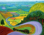
From the first experiments with aerial perspective, to the Impressionists’ revision of painted light, to modernist records of the creeping modernisation of the 20th-century countryside, landscape has long been a popular and enduring genre in art. The MFA Boston’s permanent collection includes a wide variety of historic landscape paintings and drawings, but its latest exhibition looks to the contemporary scene. Where can today’s landscape artists – faced with a contemporary world that is often aggressively globalised, littered with cities and enveloped by the digital cloud – venture next?
The 10 contemporary art works in ‘Landscape, abstracted’ celebrate the beauty, power and intricacy of the natural world, but approach it sidelong through a series of combinations, contrasts and fragmentations. One new commission, an enormous wall painting by Jason Middlebrook, seems to feed the landscape through a prism, or perhaps some early computer program, fragmenting it into patterned lines that could be barcodes or woodgrain. Another, by Anne Lindberg, extends coloured threads across the gallery space, suspending a landscape in the air. Tara Donovan creates an cumulus cloud out of Styrofoam cups; Teresita Fernández cuts soft, moss-like patterns into sharp metal; Barbara Gallucci conflates garden furniture with the nearby hedge.
Click on any image to open the slideshow.
‘Landscape, abstracted’ is at the MFA Boston from 16 August 2014–30 July 2017.
The post Gallery: ‘Landscape, abstracted’ at the MFA Boston appeared first on Apollo Magazine.
SOURCE: Apollo Magazine – Read entire story here.

Cool Art on The Fish Indie Network

(above by Nicole Ray)
I wanted to take a second today to talk about one of DA’s favorite sponsors. Fish Indie is a really great ad network we’re a part of that helps artists and crafters stand out when trying to sell their work online. All you need to do is paste a link from your Etsy shop, and Fish Indie takes it from there. In seconds your banner is automatically generated for you with your product’s image, description, and price. Your ad instantly goes live across Doodlers Anonymous and other fellow sites, like Illustration Friday, Brown Paper Bag, and Pikaland. It’s a totally stress-free way to have your Etsy shop seen by an audience relevant to you.
Here are some talented artists that we wouldn’t have discovered if they weren’t on Fish Indie:

To the Moon and Back by Sarah Trumbauer

Soul Biology by Ursula Hart

Lola by Nicole Canovas

Ice Cream Print by The Midnight Rabbit

Lush by Nati

Day of the Dead Skull by Emily Wegener

Sleepy Hedgehog Illustration by Ucuspucus
SOURCE: Doodlers Anonymous – Read entire story here.
Artist Project: Jack + Leigh Ruby’s Car Wash Incident
Today from our friends at Art Practical, we bring you an essay by Simon Lee and Eve Sussman about “the intersection of and differences between entertainment and art.” This article was originally published on July 9, 2014.

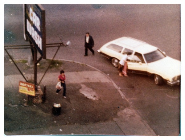
Jack + Leigh Ruby. Matt’s Convenience Store Robbery, evidentiary photo 21; 1975. Courtesy of the Artists. Photo: Leigh Ruby.
I’ve been a fan of Eve Sussman’s work from the first moment I watched her film Rape of the Sabine Women (2007) during a screening at the San Francisco Museum of Modern Art. I loved its cinematic texture—the way in which plot was secondary to the visual elements—and how Jonathan Bepler’s original score kept insisting on being present as a diegetic element. Since then, I’ve had the pleasure of viewing several of her collaborations with the Rufus Corporation and with Simon Lee. The thing that I love about her work, and the work of her collaborators, is how they use the vernacular of classic Hollywood and foreign film to propose poetic responses to the central and deceptively simple question, “What makes a movie?”
I think almost immediately of her 2011 video installation whiteonwhite:algorithmicnoir, which offers a full reveal of the structure of entertainment. Shot primarily in Central Asia, the video feels like the fevered dream collaboration of Jean-Luc Godard and Franz Kafka. An algorithm generates the sequence of shots on a moment-by-moment basis, with the upcoming selections queued on a monitor at the side of the room. Each viewing presents an entirely new film. While the editing structure is an essential element of whiteonwhite, the settings, production design, camera work, and acting are all clearly in dialogue with the conventions of American film noir, which makes the piece feel only more like an endless labyrinth to get lost in.
SOURCE: DAILY SERVING – Read entire story here.

University of Chicago Whitewashes Commissioned Mural, Artists Claim Censorship

This past spring, the Montreal-based collective En Masse, as part of a University invited residency program, worked with local youth to create a large piece on the side wall of an empty muffler shop on the South Side. Then, thanks to some very bad luck, the community turned against the piece – and so the arguments began.
SOURCE: ArtsJournal» VISUAL – Read entire story here.

MEGA & ROMEO – Going For Gold Wall


“After doing a few productionwalls lately (with characters and full background) it was a lot of fun painting just some style pieces with a simple background. We wanted to create a gold effect for the outline. Therefore we used darker colors for the fill and Khaki did the trick for the outline together with some shiny effects and a bright color for the 3D. The color combination worked well and the endresult turned out nice. Mission accomplished.”
Have a look at Mega & Romeo´s latest Production after the jump!
SOURCE: MYMOLOTOW – Read entire story here.
As Museums Try To Make Ends Meet, ‘Deaccession’ Is The Art World’s Dirty Word
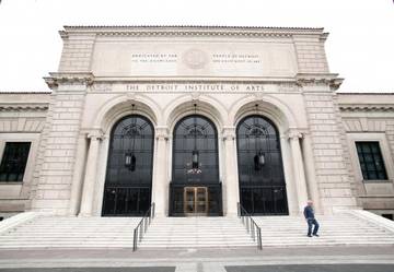
When the city declared bankruptcy, it had to put all of its assets on the table.
SOURCE: Arts News – Read entire story here.
Coloring Book Interview Series #5: Ellen Leber


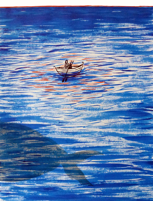
One of my favorite things about our coloring books is looking up the artist of a page I really like, because I usually end up falling straight down their rabbit hole. For example, Ellen Leber‘s atmospheric illustrations contain a depth that sucks me right into her world, especially since they are sometimes actually three dimensional.
DA: Hey there, Ellen! Catch me up on what you’ve been doing.
EL: Hi! Just recently my work has been on display and up for sale in Kahaila Cafe down Brick Lane which is pretty exciting as it’s my first solo exhibition. The opportunity came around really randomly and quickly so I put it all together in a mad rush a couple days before. A couple years ago I did some artwork for the band The Sea & I, who recently got in touch and asked if I wanted to display some artwork. It’s a monthly event run by Wilderthorn, a musician who performs at the cafe along with other performers and artists. It was a really nice set up, so whilst the band were playing their songs, my pairings were on the wall behind them. It created a really nice atmosphere as I like to try and create images that are quite immersive and atmospheric. I painted the images whilst listening to their music so the series that I ended up with created a visual narrative that could illustrate the songs. The work is up until the 2nd September so if you’re ever around Brick , go have a look–the cafe does really good cakes and coffee too.
DA: Many of your works are inspired by novels, and even the ones that aren’t seem like they could be one illustration in a larger story.

EL: I love to read fictional literature, especially fantastical and imaginative novels. Whenever I read something that I like the sound of or a sentence that sounds like it could create an interesting image, I write it down somewhere then try to paint it. I mainly paint straight from my head rather than look at other things for reference. Sometimes this is good, but I do need to try and draw from life more. I like to make images that can be perceived in different ways to different people, creating hints of narrative in different ways. I like how with books you have your own personal images of what the characters look like, what their voice sounds like, and even how names are pronounced – like the Harry Potter books and the pronunciation of Hermione’s name� and then you hear how is meant to be pronounced in the film! Also, using literature as inspiration for an image means that you are creating something that is from your mind and influenced by words and descriptions rather than copying an existing image. It is really hard not to copy images that you like. Obviously my work isn’t completely original, but I find just working from text forces me to use my own visions.
DA: My personal favorite pieces of yours are the three dimensional drawings, like A Paper Forest. What inspired you to explore this unique style?


EL: The Paper Forest was inspired by David Hockney’s set designs. I didn’t know he made stage sets and I thought they were amazing. I really like the idea of creating an atmosphere that the spectator can immerse themselves into, so I created a small scale paper forest. I wrote a short story about a man who left his village and went in search for somewhere new to live. He found a lake with Narwhales swimming in it and as he carried on he found a settlement in the forest near the lake. However, the settlement had a dark secret� Instead of painting images that tell the story I decided to make a three dimensional set of the forest settlement and the lake where the story is set. This then allowed the spectator to create their own story using the forest settlement as a base. I guess I like to encourage people to use their own imagination and I find it interesting to see how varied different individuals responses are.
DA: What memorable responses have you had to your work?

EL: When I exhibited the Paper Forest most people thought it was a boy who had done the work. People usually comment that my work is quite dark and that they don’t expect it from me. I don’t mean to make it dark. I just like to make it a bit more interesting and to create stuff for adults, as when you say the word illustrator people automatically think children’s books. The main sort of responses I get and that I quite like are the comments about how the images tell a story, which is my main objective when I paint stuff.
DA: What is your dream project?

My dream project would be to design and make a theatre set!
DA: I would love to see how you colored your own illustration in our coloring book!

SOURCE: Doodlers Anonymous – Read entire story here.
Olivier Messiaen: beyond time and space
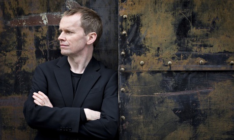
Composed while he was a prisoner of war, Olivier Messiaen’s Quartet for the End of Time seems to touch the far edges of human experience, writes pianist Steven Osborne
My interest in Olivier Messiaen’s music started in my teens, when I heard a couple of his Vingt Regards sur l’enfant-Jésus. I was intrigued, but by no means bowled over. Still, I liked it enough to ask my mum to buy me the score, and thereafter found myself increasingly captivated by its remarkable musical language. In particular, I was fascinated by the juxtaposition of deep calm and great complexity. I have always been drawn to music with large contrasts. When I play, my default position is to reach for the extremes, to seek the greatest possible emotional range. It is rare that I find a piano I can play both as loud and as soft as I want. It feels slightly juvenile, to be honest: the desire to go from a tiny whisper to banging the drum as loud as I possibly can. But there we are those are my raw instincts, and Messiaen lets me give full rein to them.
The Quartet for the End of Time is perhaps the first of Messiaen’s works in which the contrast between movements becomes truly extreme: there is a new level of violence in the music. It is not hard to imagine why this might be, given the work’s famous origins, written while Messiaen was a prisoner of war at the Nazis’ Stalag VIII-A camp. The struggle to not only endure the terrible conditions, but also to incorporate the experience into his Catholic faith, must have been profound. (Henri Akoka, the clarinettist for the premiere of the quartet, asked Messiaen to join him in attempting to escape; Messiaen answered: "No, it’s God’s will I am here.") The result is a work more emotionally engaged than any Messiaen had written previously. To me, it is the most open and vulnerable of all his compositions, its religious certainties balanced with a palpable sense of longing.
Continue reading…
SOURCE: Classical music | The Guardian – Read entire story here.
Ellipsis #74
Paradies: Glaube (2012) (Paradise: Faith)
Ulrich Seidl
German/Arabic
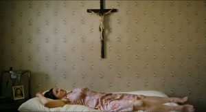
 Ulrich Seidl’s Paradise: Faith (2012), the second film in the Paradise trilogy, could be seen as a complement to its predecessor Paradise: Love (2012). While in Love, Klara (Margarethe Tiesel) tries to overcome a spiritual crisis through sex, here Anna Maria (Maria Hofstätter, in an intensely physical performance that rivals Tiesel’s brilliant portrayal) supplants physicality with Faith. What the previous film did with love, Faith does with religious belief, charting one person’s attempt to find Faith in a world that increasingly thwarts it. More precisely, the film refracts this quest through an Existentialist prism, producing a portrait of the search for meaning through Catholic values in a world where they have been rendered invalid. Like Klara, Anna Maria discovers that Faith, which is considered a private commitment, is invariably shaped by the social and political systems they are practiced within. Seidl’s film subtly plays with our judgment of the central character and dodges any easy association of her character with her belief system. The contradiction between her catholic principles and her demeanour with her estranged Muslim husband (Nabil Saleh) is less an indication of the fickleness of her Faith than a demonstration of the difficulties of having Faith in our times. The film has been characterized as a comedy in some critical quarters and that very classification speaks volumes about our Enlightened epoch, in which irrational faith can’t be anything but a fodder for laughter. Seidl’s clinical detachment – typified by his head-on compositions where characters come across as subjects in a behavioural study – from Anna Maria’s rituals is genuine neutrality rather than condescending irony. For an unprejudiced eye, all her actions – be it the self-flagellating routine or her insistence that non-Catholics are leading a sinful life – would appear as gestures as valid, understandable and worthy of empathy as Klara’s attempts at finding love.
![]()
SOURCE: The Seventh Art – Read entire story here.
Arnold Schoenberg Playing Cards
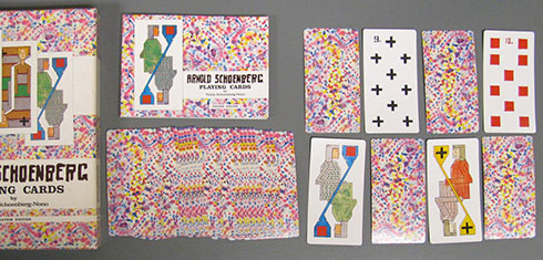
 In the early 1900s, Arnold Schoenberg created three sets of playing cards, incorporating grotesque images and visual puns from his drawings. This facsimile reproduces them.
SOURCE: Guggenheim Blogs – Read entire story here.


